

Geography of Housing Costs
What does the data actually say about housing costs across this country?


Preamble:
One of the most difficult things about having any substantive policy discussion in 2025 is that everyone is coming at our problems with massively diverging priors about the underlying data. If people cannot agree on the actual facts, converging to a solution is functionally impossible.
It is this dynamic that underpins our desire to bring y’all along with us as we dive into housing affordability. We will be sharing what high-quality analysis is saying as well as what the data actually shows in hopes that this will help reduce information frictions.
One version of what this looks like is our “Weekly Roundups”, where William Miller does an incredible job collecting and presenting intel, and another version is what I’ll be doing here.
Every week I’ll take the time to collect and present important pieces of data related to housing in this country.
Note: if you would like to hang out with me while I build these graphics, and perhaps learn how to do it yourself, join me during my regular “building streams” on Twitch.

Introduction:
Today, in the inaugural essay in this series, I’m going to be examining the geography of housing costs in this country, both at the aggregate level and zooming into sub-regions. Next week I’ll be seeing how these same maps have changed over time, but I think it’s important to first establish an understanding of what the dynamics are like now.
From my cursory, non-causal analysis, two interesting observations jump out:
At the neighborhood level, measured by census tracts, the variation in housing costs can be best explained by variation in income. Areas where people make more money cost more to live in.
The core issues behind housing affordability vary enormously across the US. The dynamics that dominate a Midwestern city like Detroit are totally different from those of a West Coast city like San Francisco.
In order to generate all of this analysis I have used American Community Survey (ACS) data provided by NGHIS. These graphics in particular were taken from the 2019–2023 survey, the most up-to-date that they have right now. If you would like to know more about the ACS I recommend you read their documentation here, and if you have questions about anything feel free to drop them in the comments or stop by my livestreams.
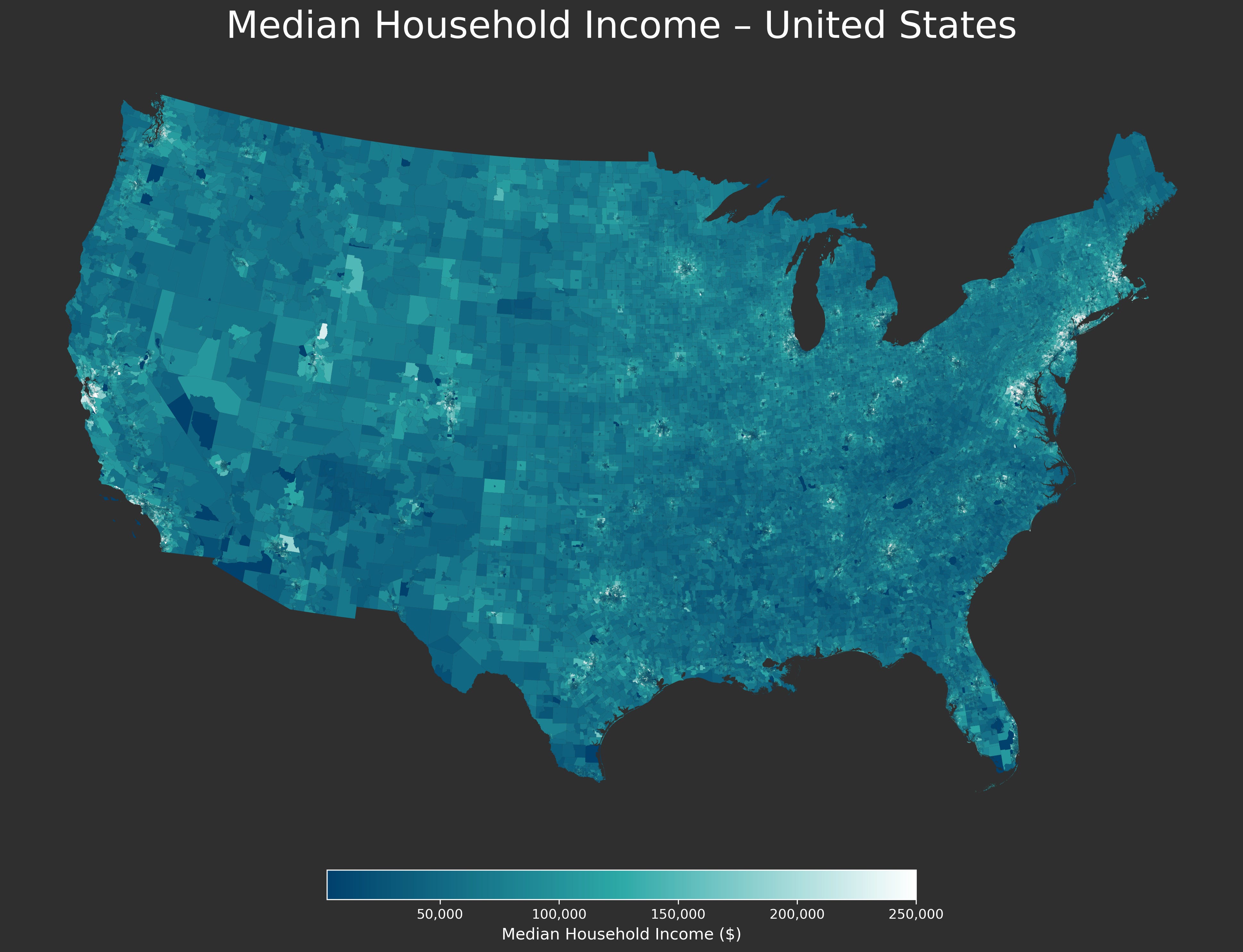
National Level:
From looking at this map, two regions of very high housing prices jump out—namely, the Northeast corridor stretching from Washington DC to Boston, and then the American West from Denver to the Pacific. In particular, California is marked by very elevated home prices.
However, when looking at the neighborhood level, you can see that this is mostly explained by high incomes in these areas.
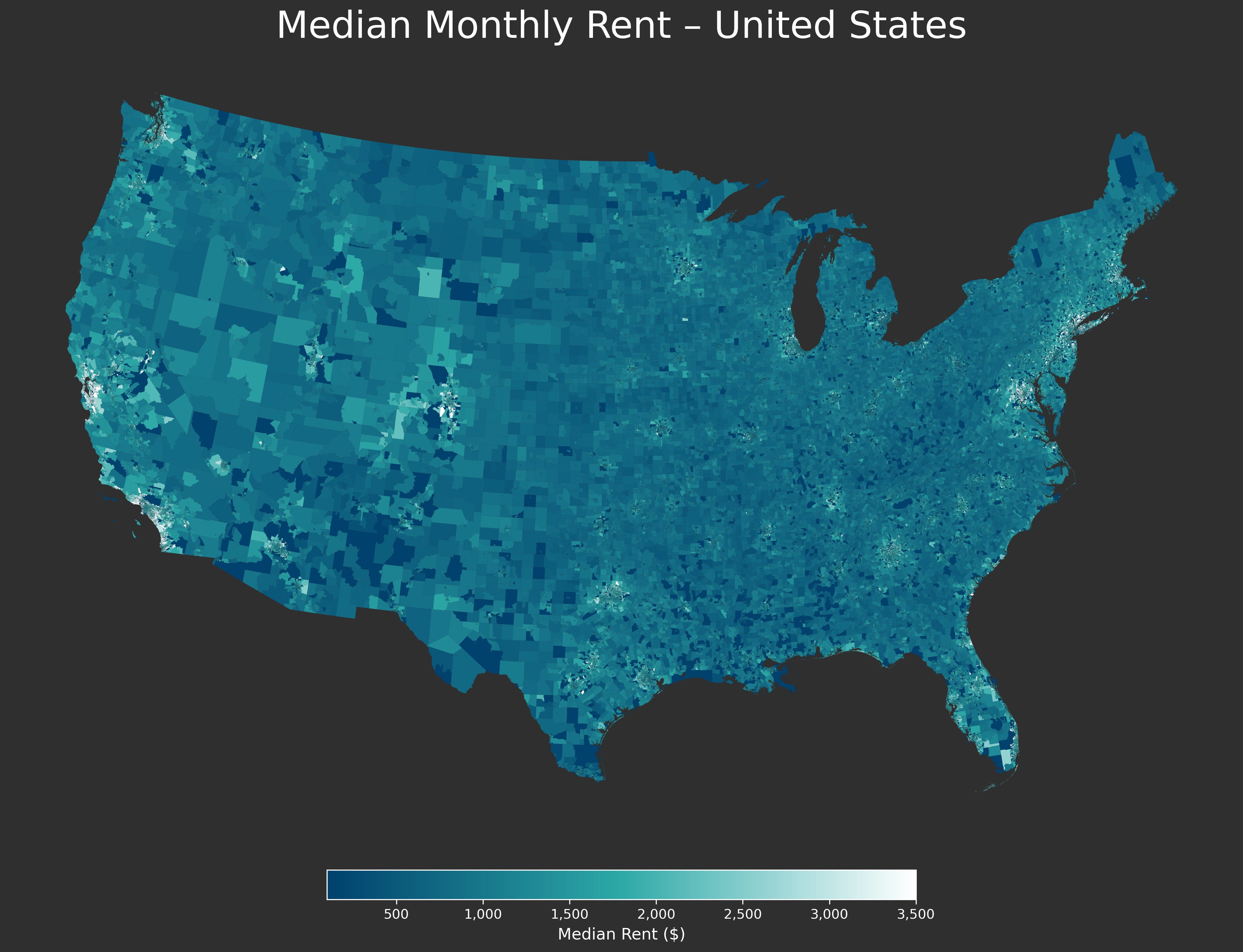
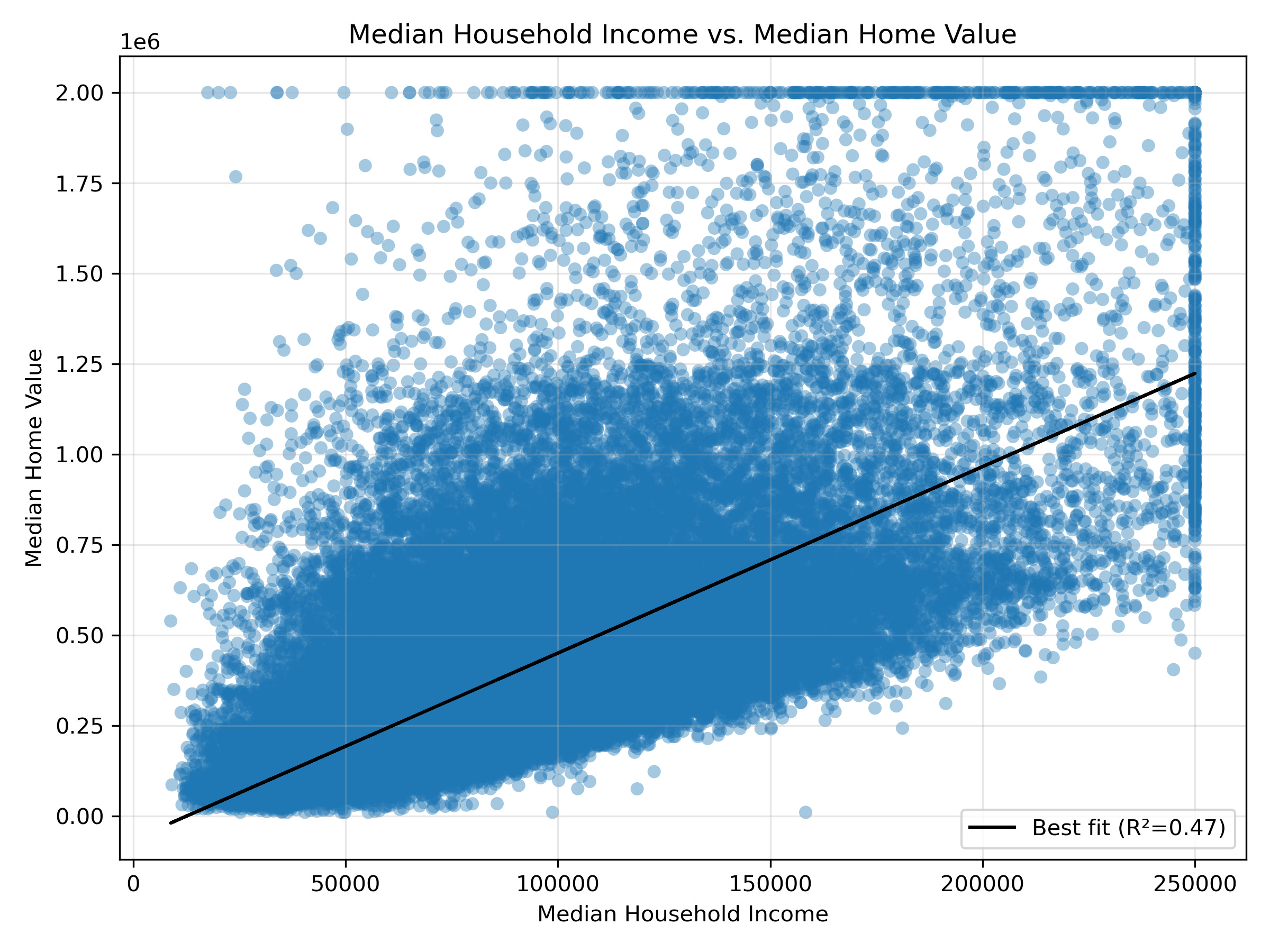
Below is a scatter plot of “Median Household Income” vs. “Median Monthly Rent”
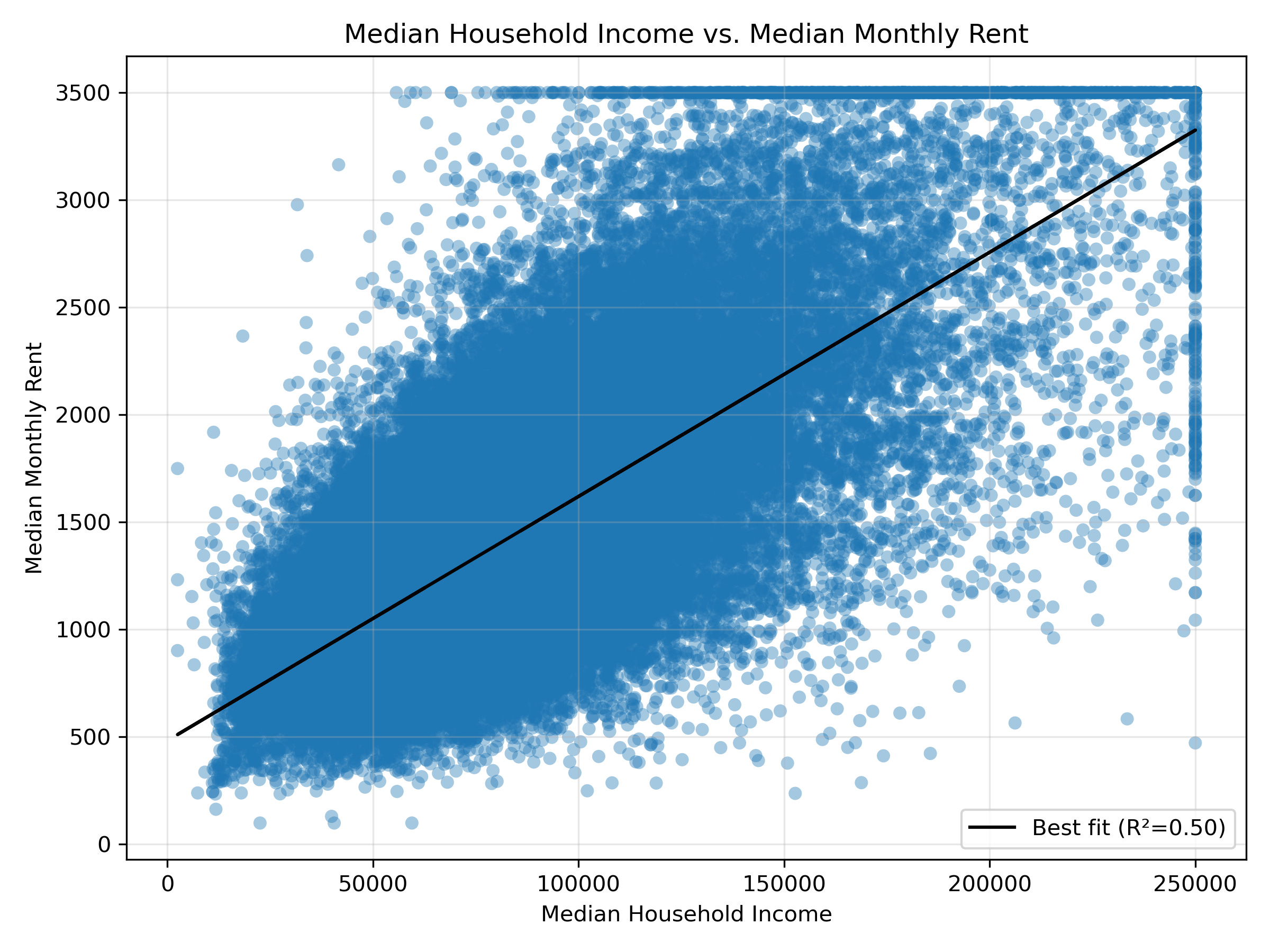
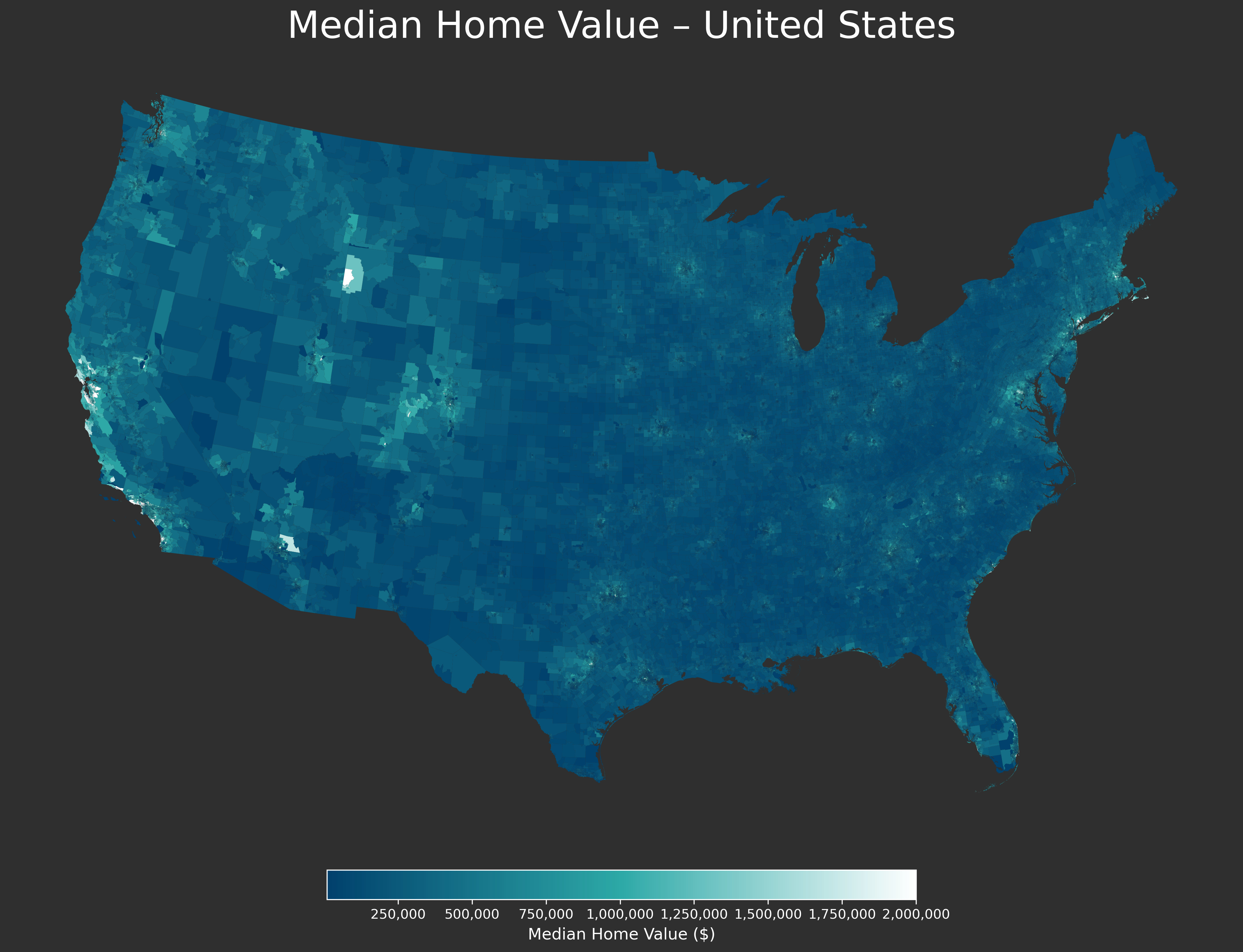
If you look at home prices the shape of the relationship is very similar.
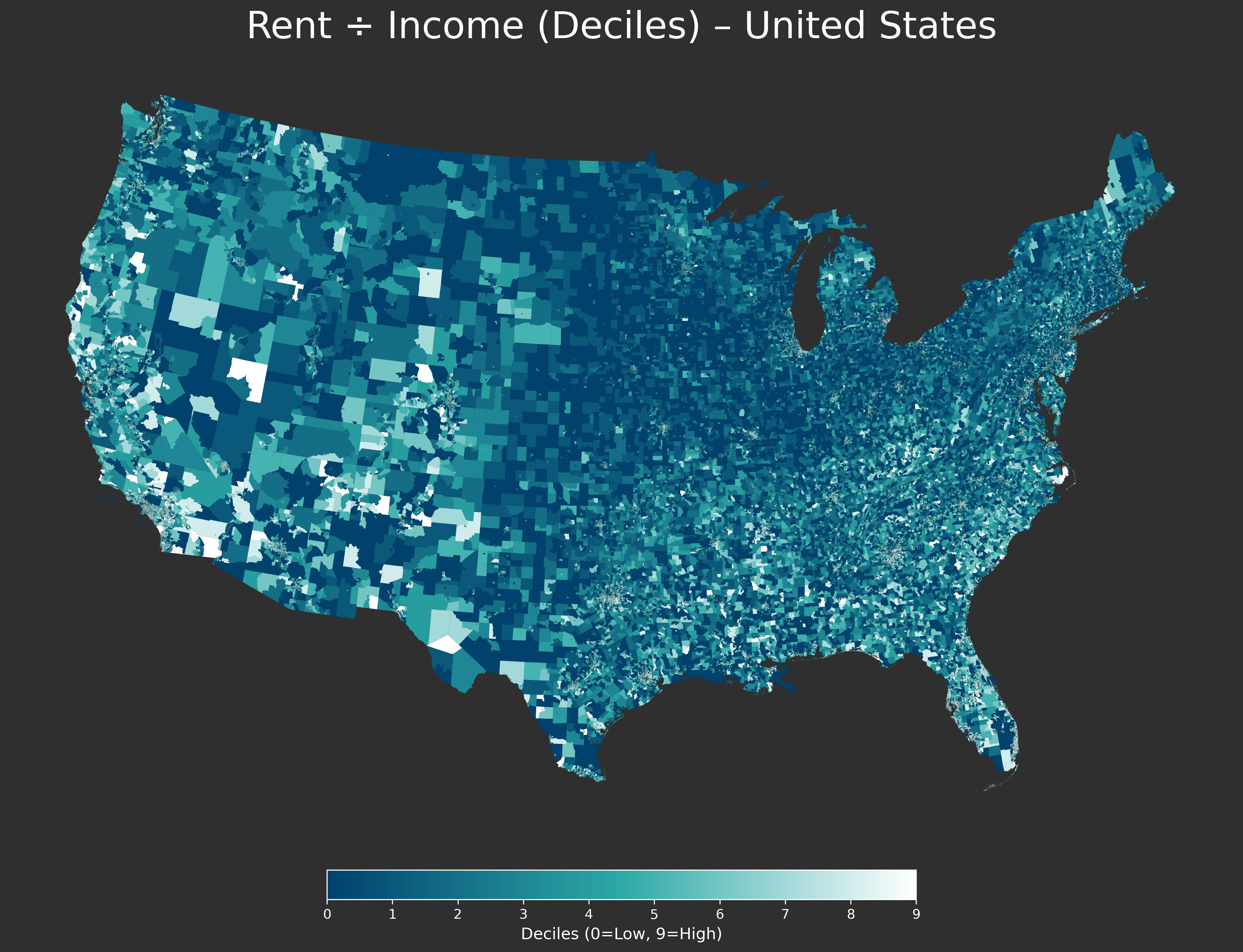
Looking at this same issue from another angle, you can examine where housing or rental costs are relatively high, or low, compared to income. Defining this as Median Rent / Median Household Income gives the following map. California and the Northeast are relatively expensive and the rural Midwest is relatively cheap.
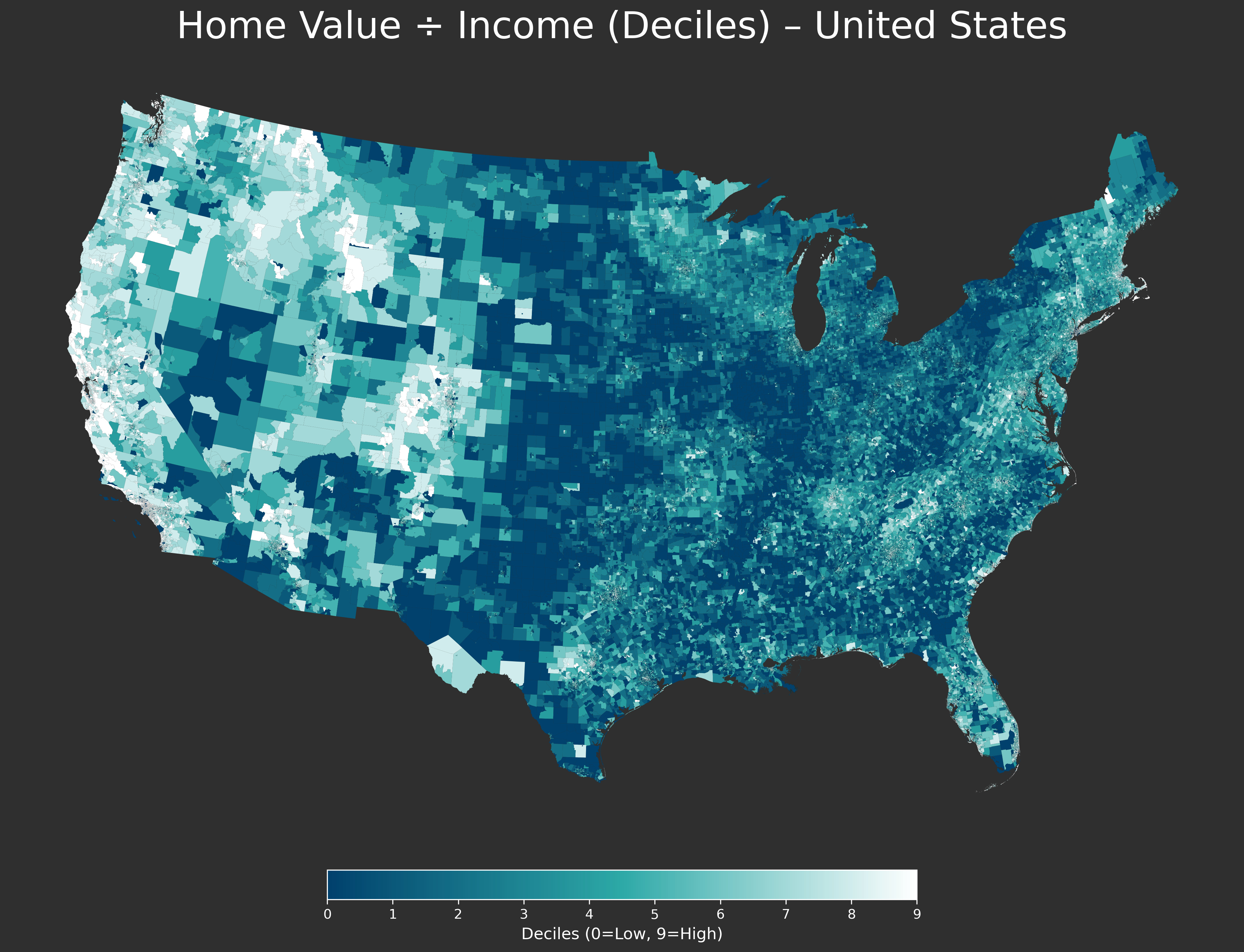
Using home prices rather than rent the picture is very similar with the expensive regions of this country standing out even more starkly.
Note: I am not looking at costs per square foot, or the quality of the accommodations. Anecdotally, for example, even if both the rental prices and incomes in a place like the DC suburbs or the Bay Area are roughly comparable, the size and quality of the housing is not. If you would like me to examine other variables let me know.
Sub-Regions:
At the national level it can be a little hard to see what these graphics actually show. With that in mind, I’m going to present maps of the median home value and rental costs zoomed into the Census’ geographic regions of West, Midwest, South, and Northeast.
If there’s any additional analysis you’d like to see — such as zooming in on a specific region, looking at the ratios of income to prices, etc. — please “like” this post, and comment/restack with your question and I will be sure to share it with you.
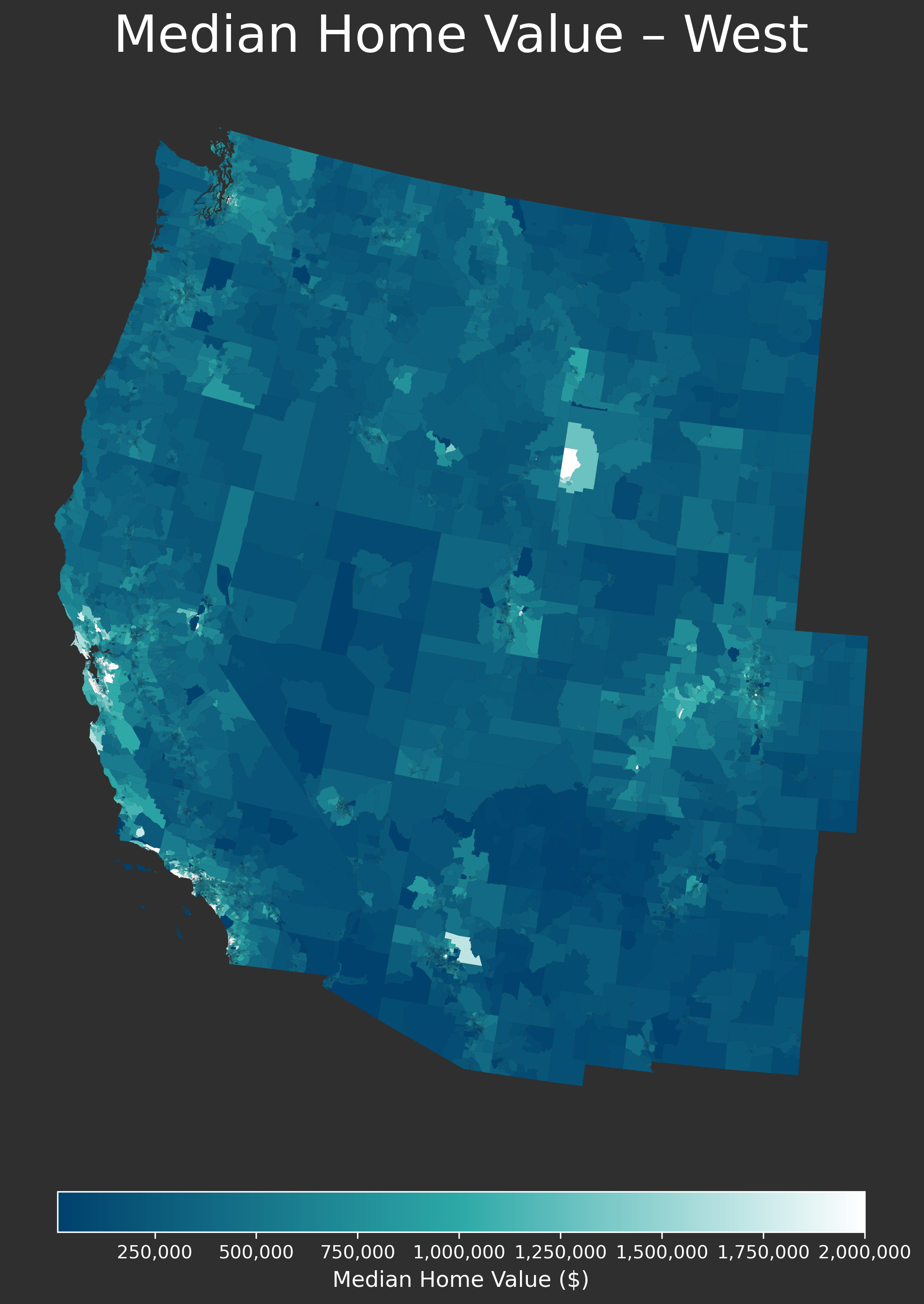
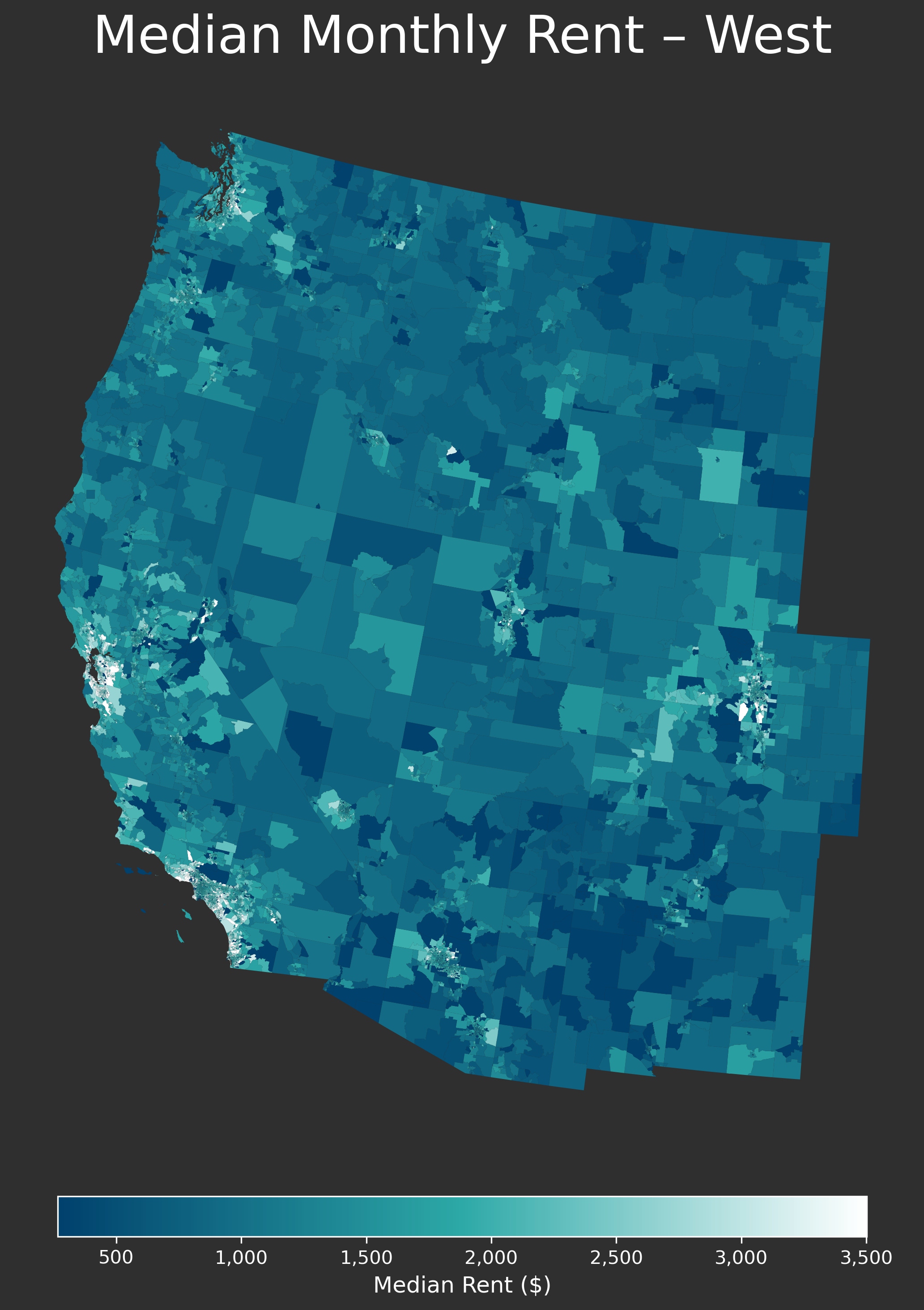
West:
The West is defined by spots of very elevated housing costs surrounded by relatively cheap areas. Certain vacation spots, such as Jackson Hole, can also be seen.
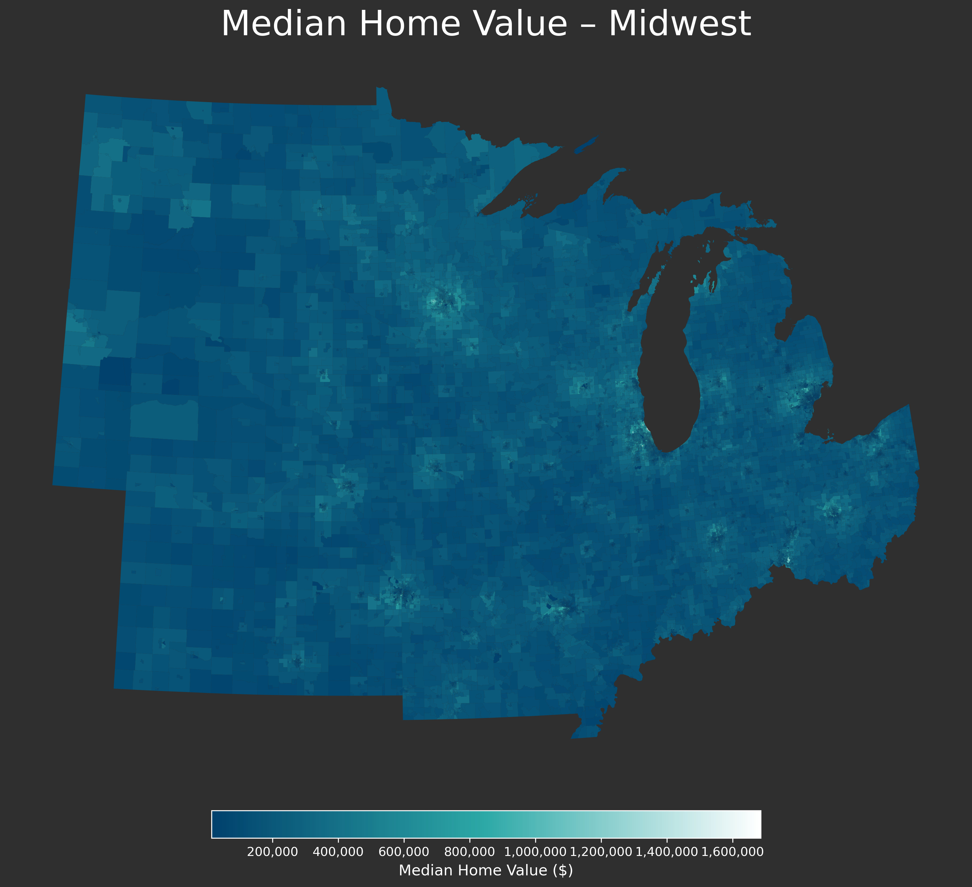
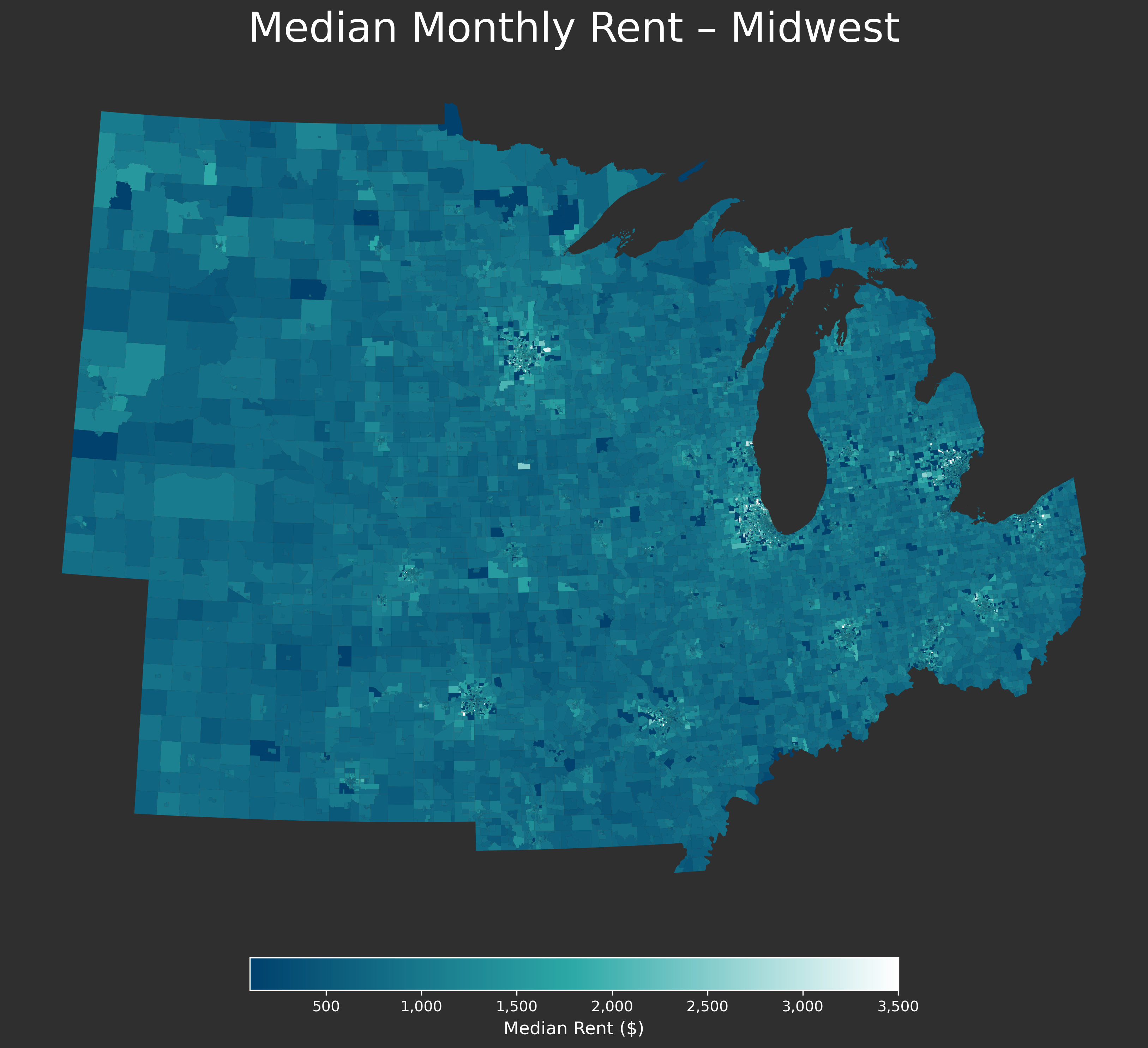
Midwest:
The dynamics here are primarily depressed rental costs in the urban cores combined with expensive ring suburbs.
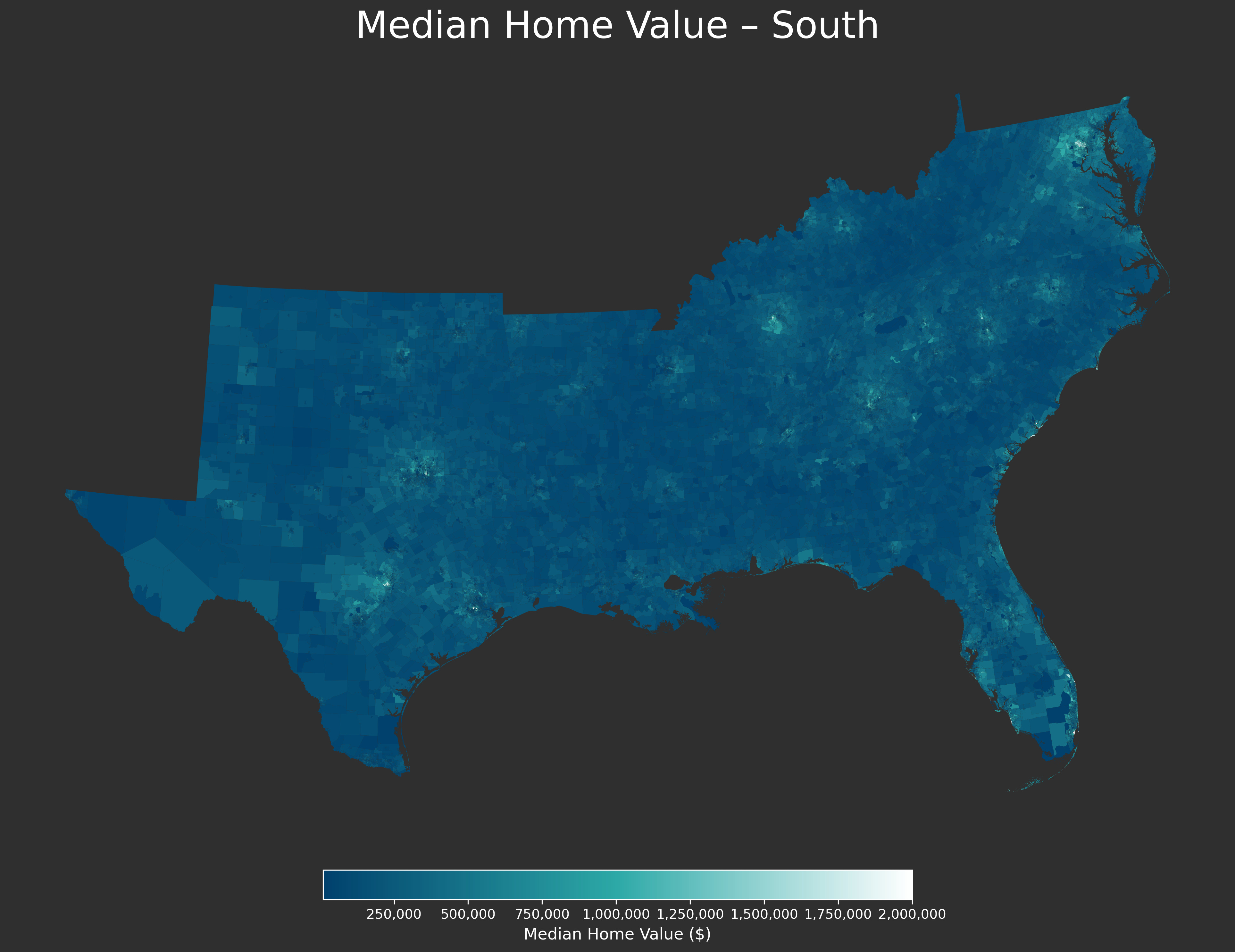
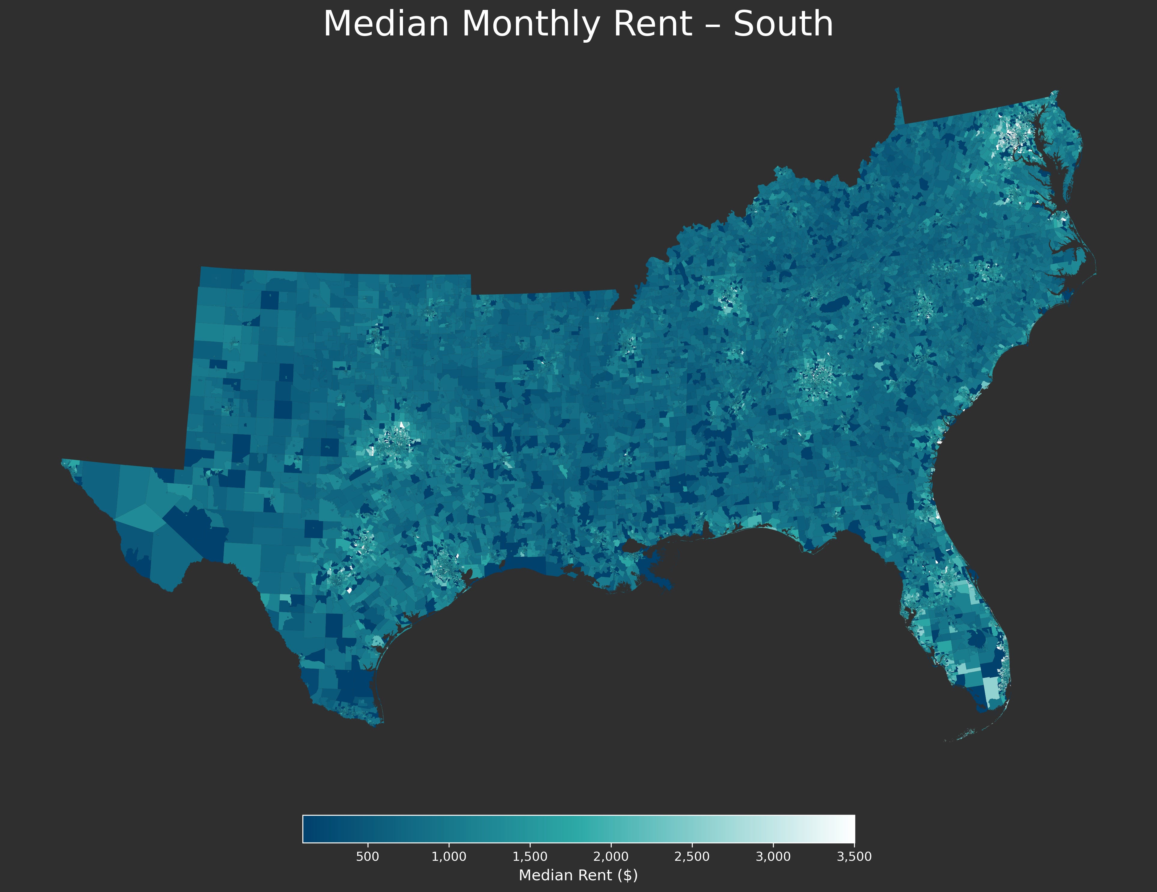
South:
Housing prices are relatively low here and although there are suppressed urban areas like southern Dallas or Houston, you also have pockets of expensive housing in cities like Nashville, Raleigh-Durham, or DC — which are also defined as part of this region.
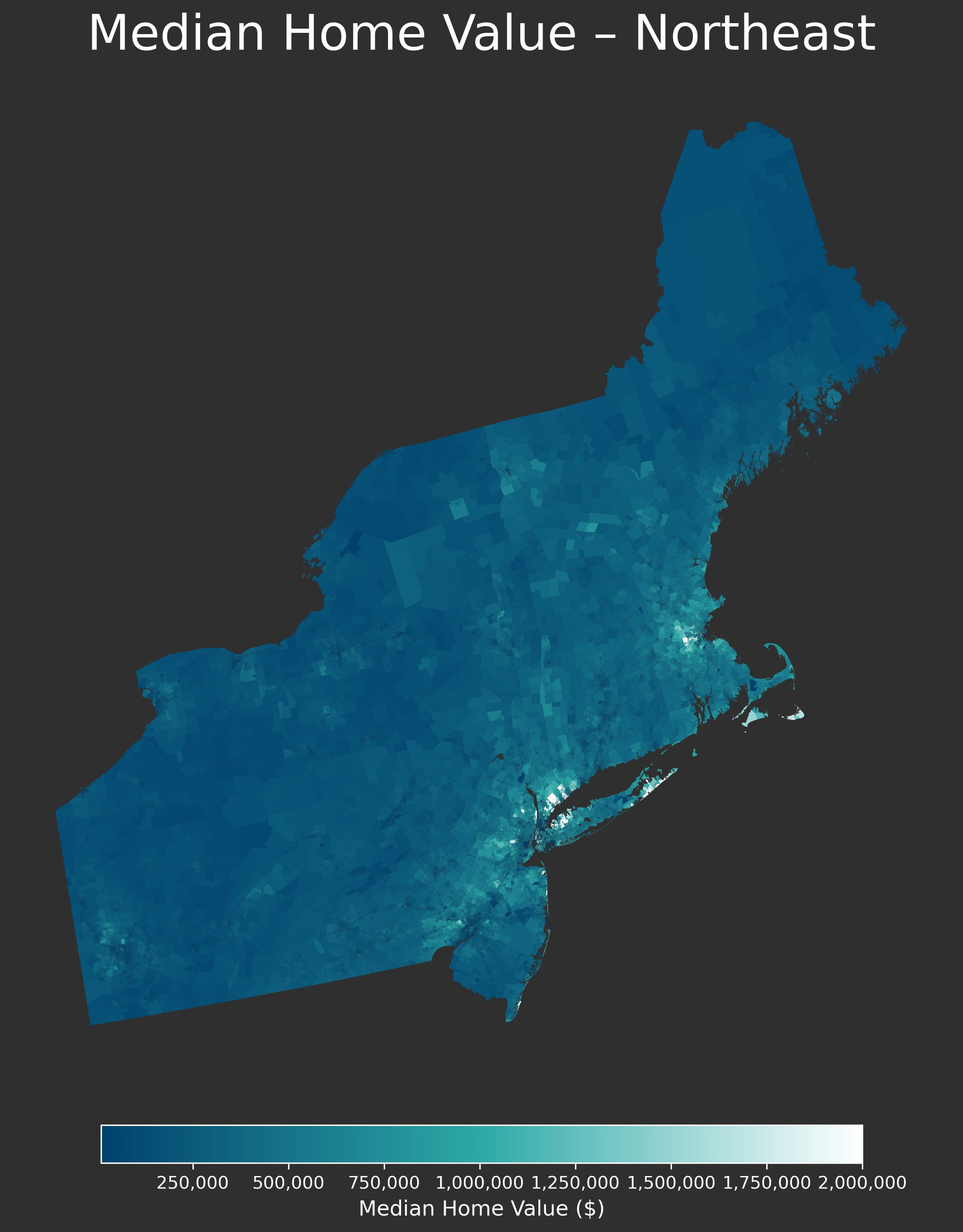
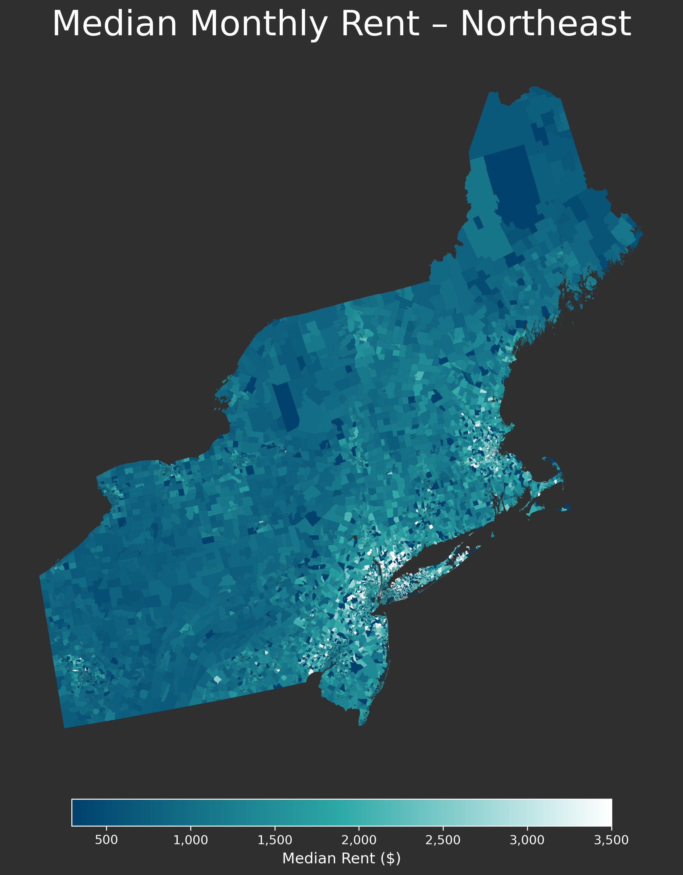
Northeast:
This region is defined overwhelmingly by very expensive housing in and around the urban cores as well as cheap housing in rural areas.
In short, the data is heterogenous, reflecting the high degree to which different markets and regions face widely-varying sets of challenges in terms of supply and affordability. As we push further into our current policy sprint and run more granular analyses of the data, the nature of these challenges should become more evident.
Thank you so much for reading along and I’m excited to keep presenting information on housing in this country. Next week I will be looking at how housing costs have changed geographically over the last 20 odd years.
giving me more to read and its 9 pm
Smart idea starting with laying down a common starting point. All too often now days, especially on social media, people tend to talk past each other!
Looking forward to the next post on the historical trend of southern housing prices. I think it’s a growing region with huge potential