

History of Housing Costs
How have housing costs evolved in this country?


Welcome to the 2nd article in our series here at Boyd where we examine what the actual data says about housing costs in the US. Last week I looked at the most up-to-date figures, which you can find here, and today I’m expanding this analysis to the previous 15 years.


Data:
In order to generate all of these graphics I have used the American Community Survey (ACS), provided by NHGIS. The ACS is an incredible resource created by the government and shared with the public for “free”, but it is also a “survey,” which means it comes with some tradeoffs relative to other official data.
Take for example the most commonly used ACS dataset, their 5-year surveys, which offers unique geographic granularity for important social, economic, and demographic outcomes. Since they cannot ask everyone for this information every year the census conducts national surveys and then combines this with some statistical guesswork to estimate the data. In order to bolster the robustness of their results and smooth out random variation, they lump 5-year windows together.
As a result of the choice, unlike the decennial census, which is a single snapshot, the ACS is a continuous ‘average’ of the 5-year window. Note: I’ve made what I believe to be the standard stylistic choice of representing each “five-year” dataset by its midpoint, but you should always interpret the years less as discrete objects and more as estimates which bleed into each other. NHGIS provides data annually starting with the 2005-2009 survey and ending with 2019-2023.
From my cursory, non-causal analysis, two interesting observations jump out:
The South had the highest rental costs relative to income, but Northeast had highest fraction of people paying over 30% of income in rent.
Starting in the 2010s, in the West home prices surged in both relative and absolute terms. By contrast, prices in the Midwest have remained very stable and low.
By all measures housing affordability has degraded since the late 2010s.
The remainder of this essay is structured as follows. First, I will present two gifs of the history of housing costs in the US. Second, I will look at the evolution of housing costs at the national level before breaking it down by subregion.
GIFs:


If there is a specific region or city you would like to see a gif of, just ask by commenting or restacking, we would be more than happy to generate it for you.
National:
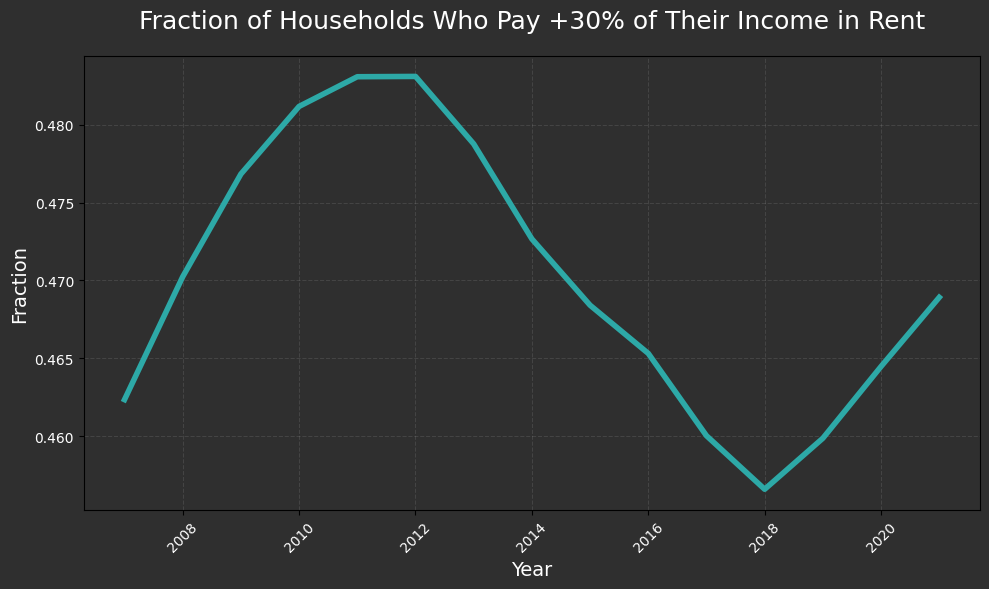
Median Rental Costs:
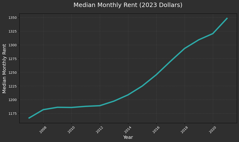
In real, absolute terms, rental costs have monotonically increased over the entire period.
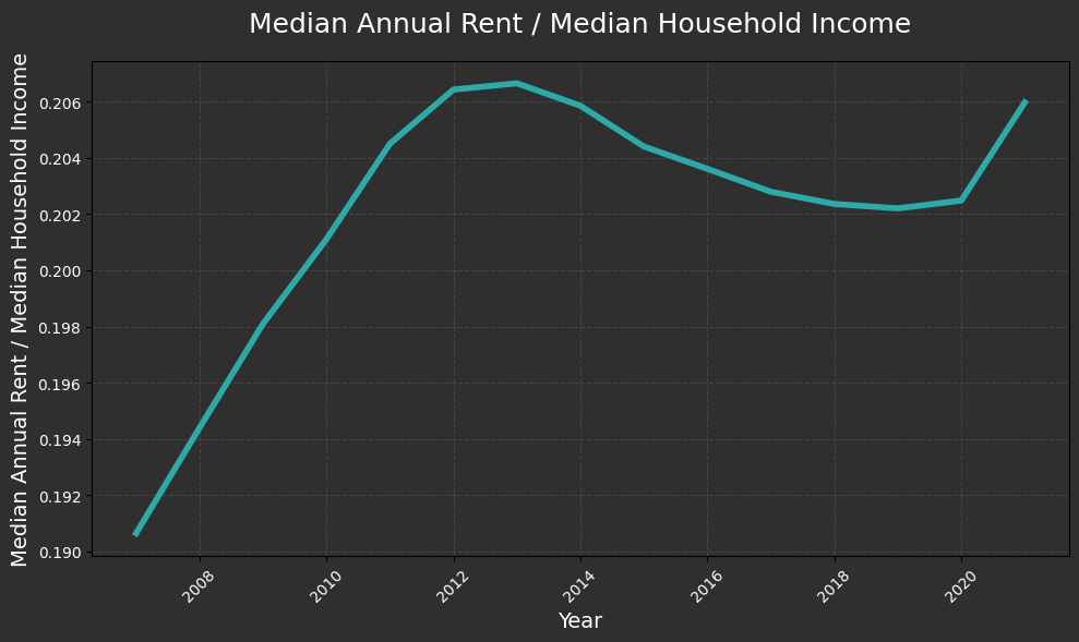
When looking at relative rental costs, the pattern that emerges is a hump shape with affordability improving from a low after the GFC until ~2020, when affordability began to decline. Although I should note that the y-axis on these charts is zoomed in and the variation is relatively small.
Median Home Price:
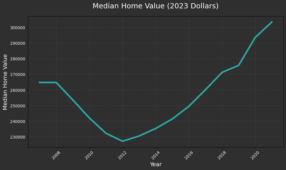
Real home prices fell after the GFC and have increased continuously since, reaching a new record high.
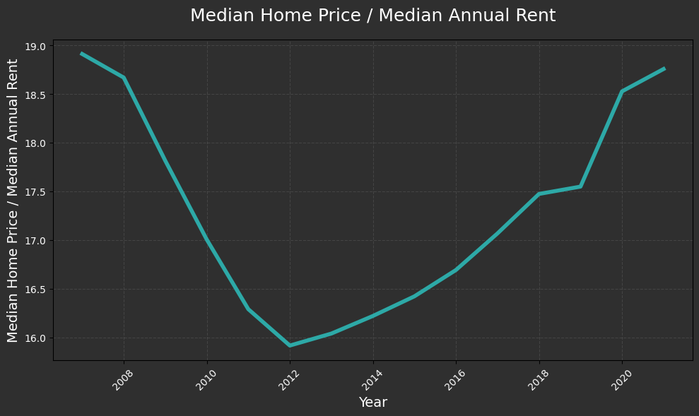
When looking at median prices relative to median income, as a rough proxy for affordability, a similar picture emerges, with ~2012 being the point at which homes began to become less affordable relative to income again.
Subregion:
For these regions I use the census categories of Midwest, Northeast, South, and West.
Median Rental Costs:
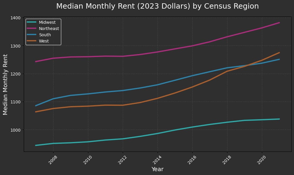
Notably, it was not until almost 2020 that median rental prices in the West passed those in the South.
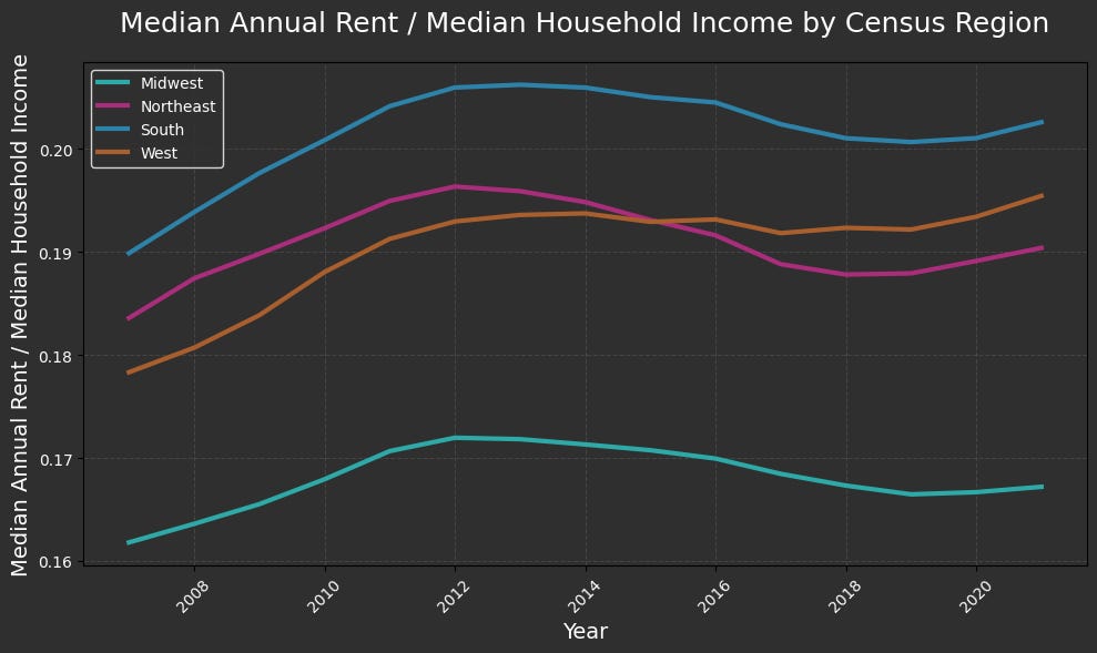
Median annual rental costs when measured in terms of income were the highest in the South and lowest in the Midwest for the entire period.

However, when examining the fraction of people who pay more than 30% of their income in rent, the Northeast was consistently the most expensive region.
Median Home Price:
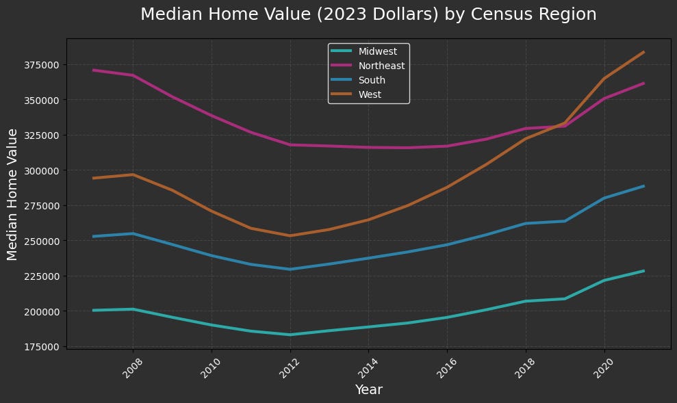
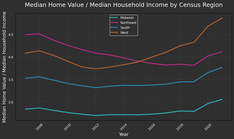
When examining home prices, the West immediately pops out. Starting in the 2010s, prices in both absolute and relative terms surged substantially, and by the end of my sample it was the most expensive region. By contrast, prices in the Midwest have remained relatively very stable and low, although they have also begun to creep up.
Conclusion:
Before we finish, there are two last things we want to talk about. First, next week we will be digging into something a little spicier so keep your eyes peeled. Additionally, we are still very much in the exploration phase of our housing sprint, and so if there is anything you want to learn with us, just ask!
Second, our essay contest is open and accepting submissions. The top prize is $2,500, an all-expenses-paid trip to DC, and the title of Boyd Fellow for a year. There is more information in the article below, but it is well worth your time to apply!

Substack author The Emergent City, who writes about Australian housing policy, says that low supply of skilled tradespeople and construction workers is slowing down new construction of housing. In part, those is because there are other major building projects (non-housing) that are bidding for their services. Is insufficient supply of tradespeople/construction workers a big issue for US housing policy?
The advertising campaign to encourage youth to enter trades sounds promising. However, I can anecdotally tell you that in high-education families (everyone with university degrees), there's an irrational "snob factor", whereby a 22-year-old adult child getting a BA in art history is celebrated but one getting a trade certificate is encouraged to go onto university--even if the art history grad is unemployed and the "tradie" cousin has a highly-paid job on a construction site.