

The Fiscal State of the US, in 12 Charts
It's not looking ideal...


As we ramp up our new sprint on America’s debt & deficits crisis — yes, “crisis” would be an apt characterization — we thought it would be useful to start with a high-level overview of the fiscal problems facing the country. And what better way to set the scene, we asked, than with some charts? So, here’s 12 of them, weaved together with some commentary.
Federal budget deficit as % of GDP
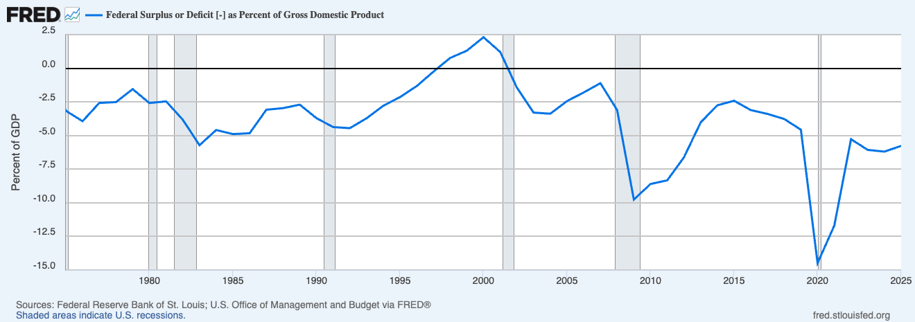
The US has run a budget deficit in all but four of the past 45 years, with the lone surpluses appearing briefly at the end of the Clinton administration. The two largest gaps in modern history came during the 2008 financial crisis and the 2020 pandemic response, when deficits exceeded 10% and 14% of GDP, respectively. Post-Covid, the government has continued to run deficits in the high-single-digit % range — historically enormous.
Federal debt as % of GDP
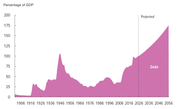
Federal debt spiked to roughly 106% of GDP at the end of World War II, then steadily declined for three decades as the postwar economy grew faster than the debt stock. Starting in the 1980s the trend reversed, and today debt is approaching the WWII peak. CBO’s projections have it blowing past that record and heading toward 175% of GDP by the mid-2050s.
Treasury is in the midst of rolling through a maturity wall.
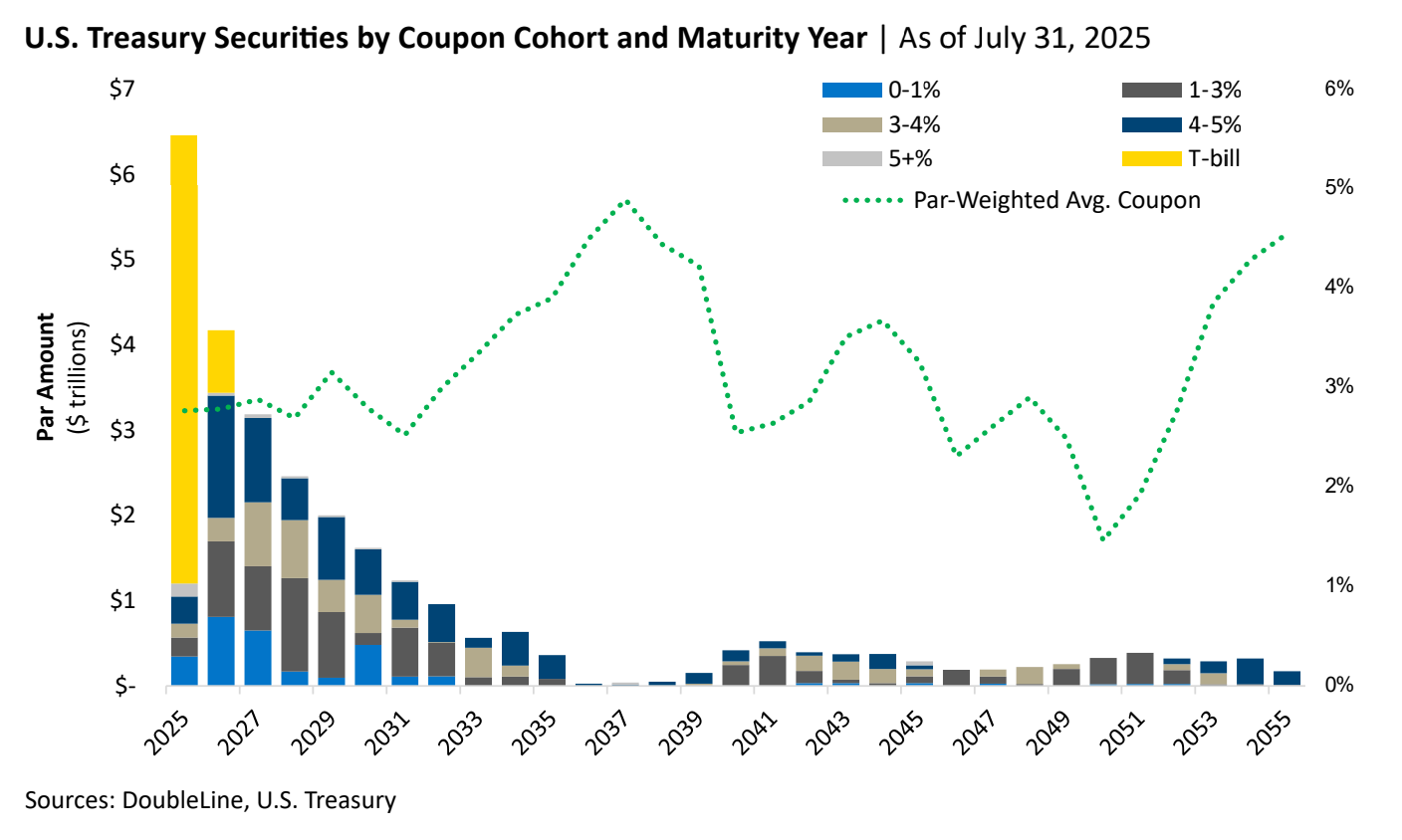
Publicly held Treasury debt1 totaled $31.41 trillion as of April 3, 2026. Of that sum, roughly 33% will be maturing within 12 months. Much of these maturities are ZIRP-era (lower-rate) issuances which must be rolled over at current rates in the spot market.
T-bills have become the path of least resistance.
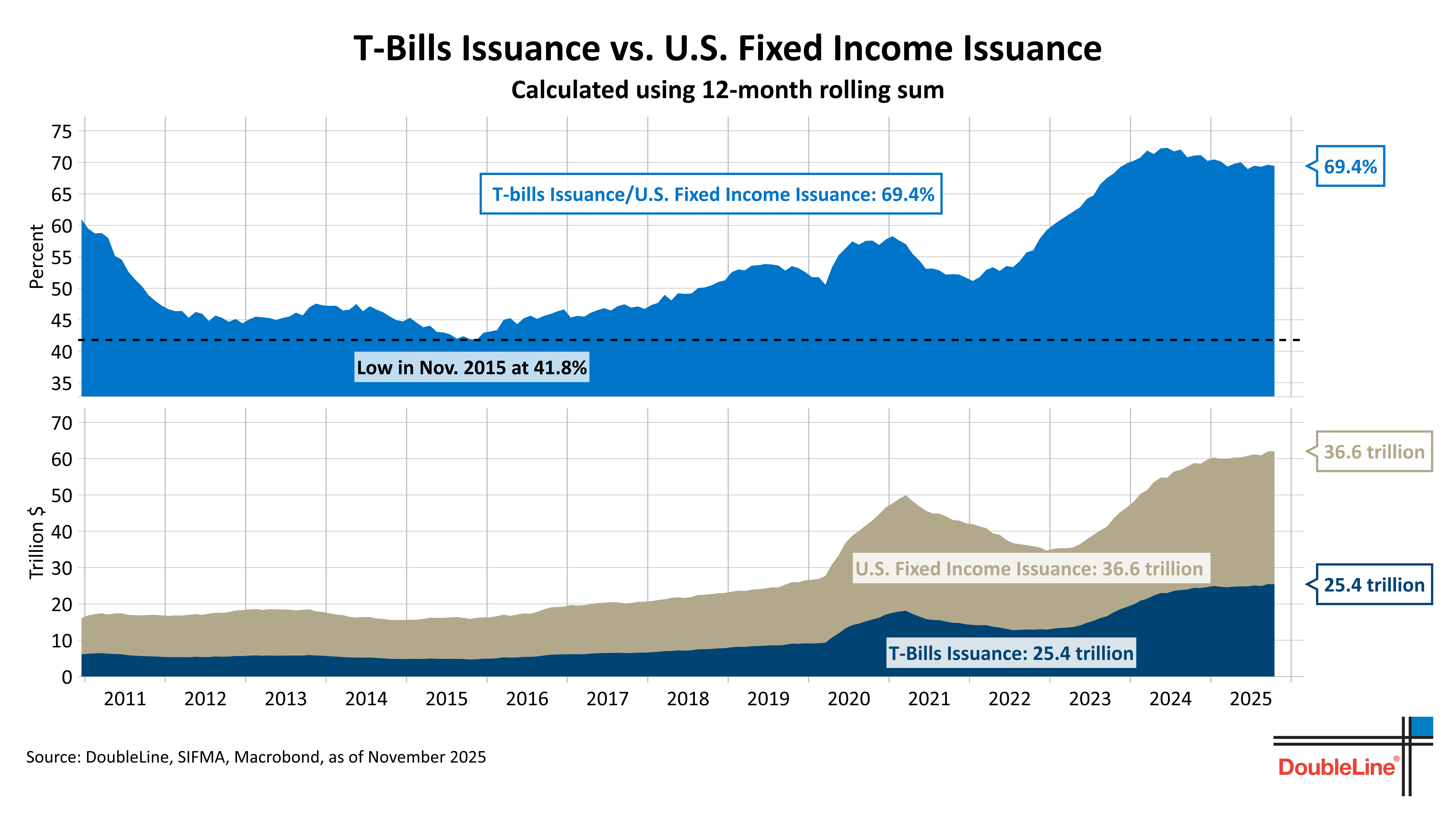
Since the yield curve is currently sloping upward — meaning that current short-term rates lower than long-term bond yields — Treasury is electing to “refinance” the longer dated maturities by increasingly issuing Treasury bills (or “T-bills,” the shortest-term debt). But by replacing long-term funding with short-term rollovers, the US is effectively setting a policy where a large portion of its debt will have to be refinanced every few months on a go-forward basis.2 This probably helps explain the president’s urgency for a Federal Reserve in rate-cutting mode in the near term.
Still, the average interest rate the US pays on its debt has more-than doubled since 2021.
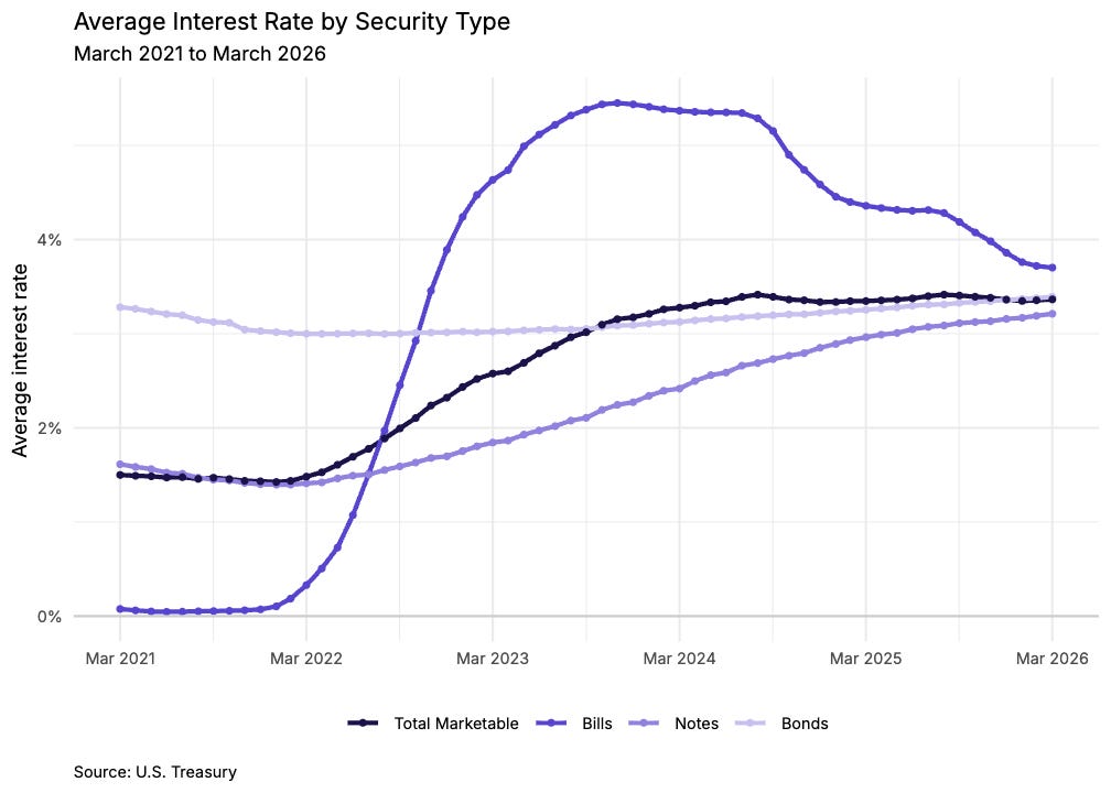
Even though T-bill rates have come off their 2023-24 peak as the Fed has eased, short-term rates are still considerably higher than the average coupon on the maturing debt. Thus the blended average rate on federal debt, which in 2024 climbed back above 3% for the first time in over a decade, could very well continue to climb as maturities continue to be rolled.
Up, up, and away!
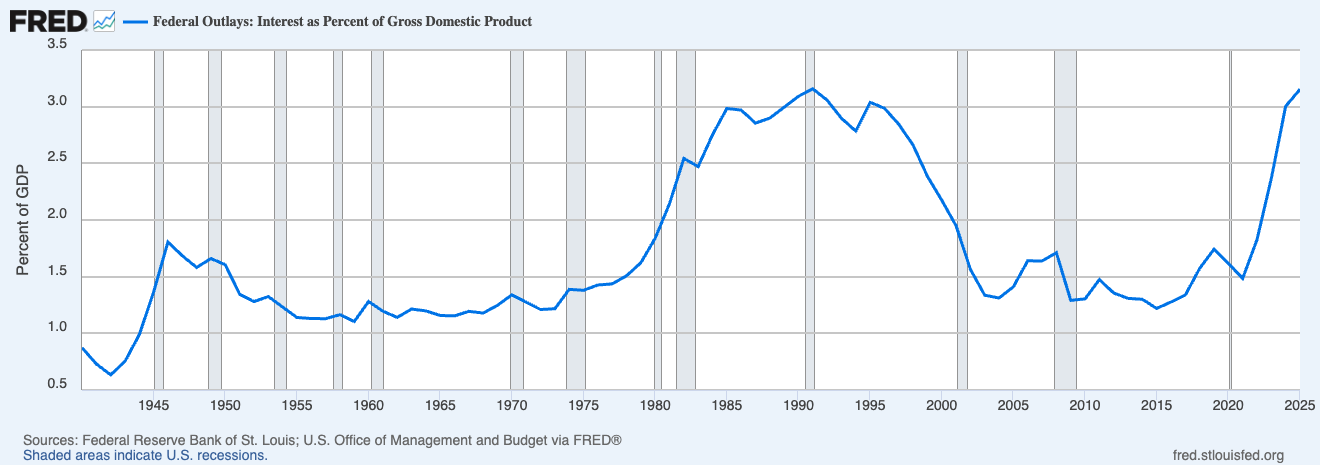
And so the above explains why interest payments on federal debt have climbed back to roughly 3% of GDP, matching the previous peak set in the early 1990s. The difference is that the 1990s peak was followed by a long decline as rates fell and growth caught up to the debt; today’s climb is happening with a much larger debt stock and no obvious catalyst for rates to return to the zero-bound levels of the 2010s. Interest is now the fastest-growing major line item in the federal budget, and on current projections will soon be the single largest.
Mandatory spending and interest eats everything.
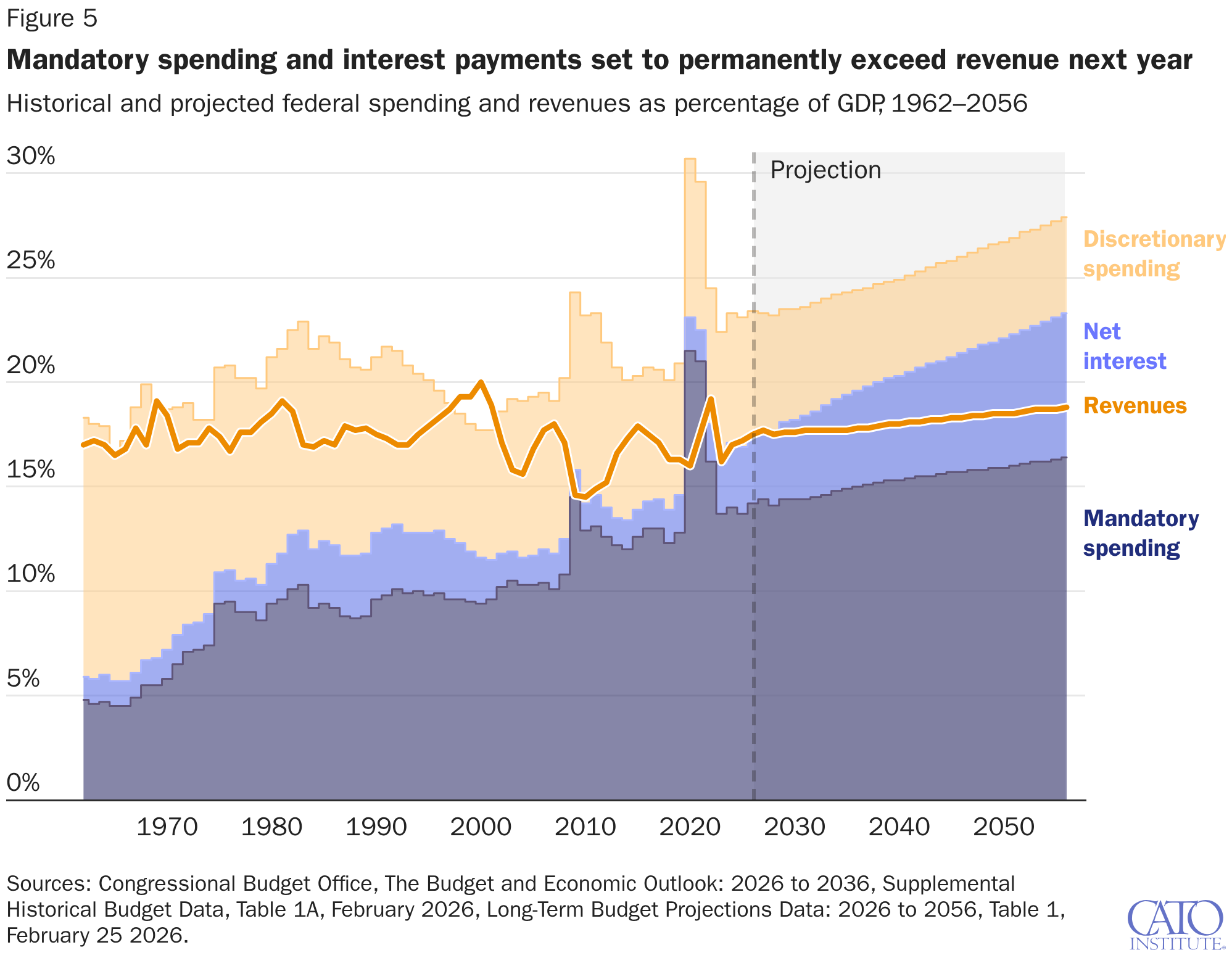
This may be the single most important chart in the deficit story. Starting next year, CBO projects that mandatory spending (Social Security, Medicare, Medicaid) plus net interest on the debt will, absent structural reform, permanently exceed all federal revenue. In practical terms, every dollar of discretionary spending — defense, infrastructure, research, federal agencies, i.e. everything but pure transfers — will be financed entirely with borrowed money.
We even spend more on interest than defense now.
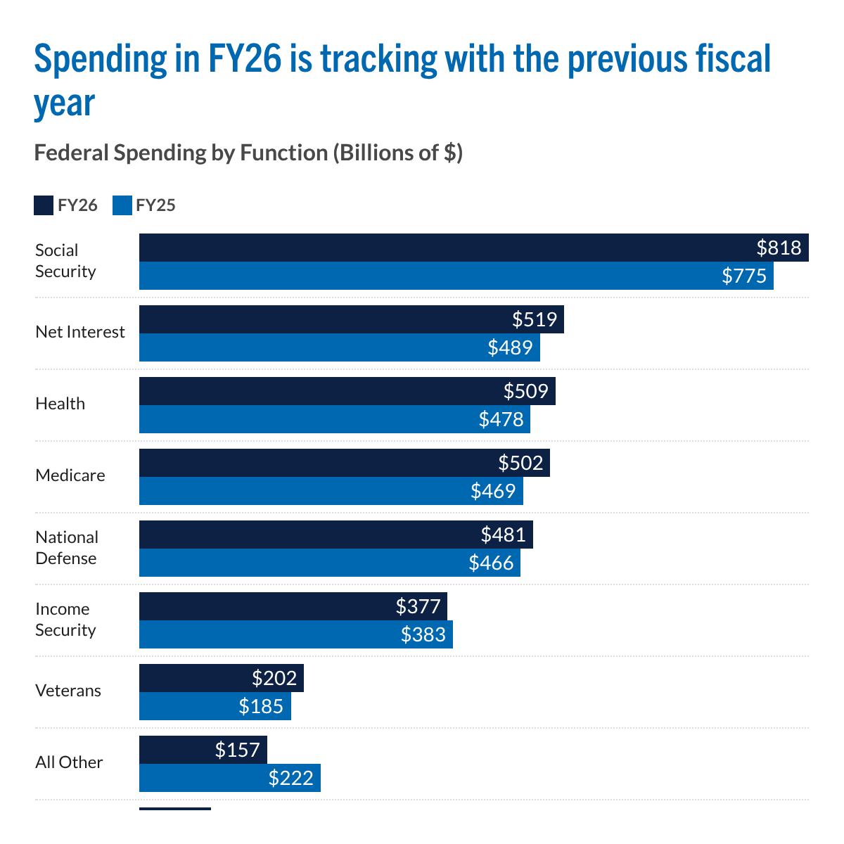
Year-over-year spending is up across nearly every major category. Social Security led the increase at +$43B, followed by Medicare (+$33B), Health (+$31B), and net interest on the debt (+$30B). Defense rose modestly, and the only category showing a meaningful decline was “All Other” — the catch-all bucket for the rest of the federal government, which includes almost all investments (the type of spending that actually carries a meaningful economic multiplier).
Who pays our taxes?
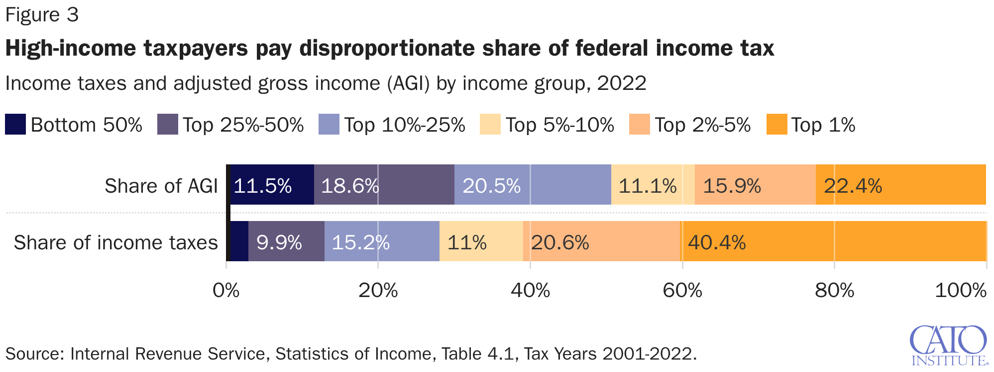
The federal income tax is steeply progressive in practice. The top 1% of earners took home 22.4% of all adjusted gross income but paid 40.4% of federal income taxes, while the bottom half of filers earned 11.5% of income and paid a small single-digit share of the total. The top 10% of earners collectively cover roughly 75% of the federal income tax bill. This concentration is worth keeping in mind in any debate about raising or cutting rates — the revenue base is heavily dependent on a small group of high earners.
Our deficit is driven by increased spending.
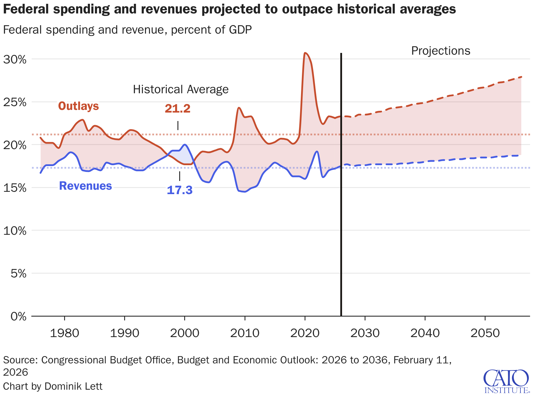
Over the past 50 years, federal outlays have averaged 21.2% of GDP and revenues 17.3%. But as revenues have remained near historical average, outlays have systematically crept up.
It’s basically just income (and payroll) tax.
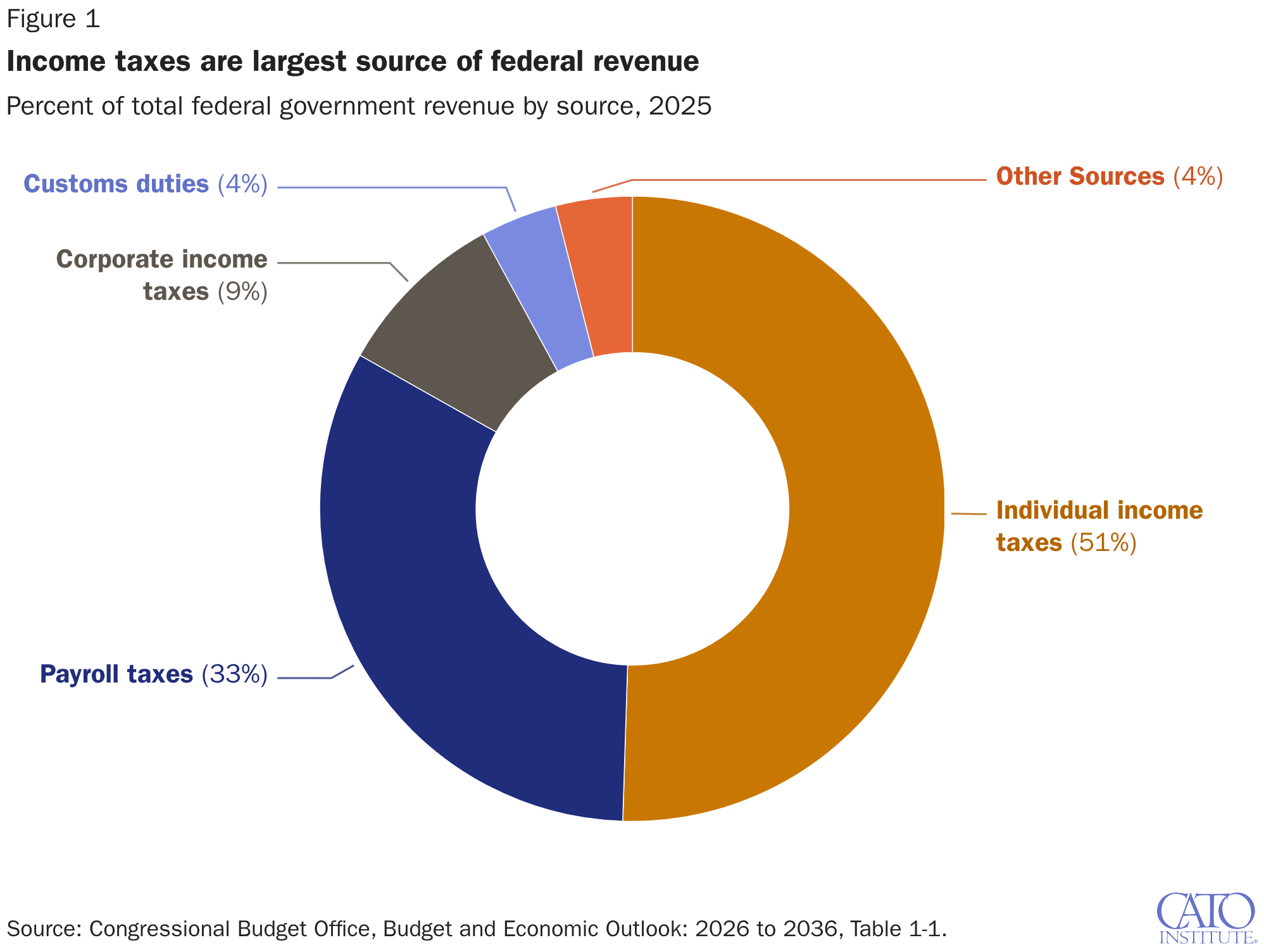
Washington's revenue base is less diversified than many people assume. Individual income taxes supply 51% of federal revenue and payroll taxes another 33%, meaning about five of every six federal dollars come directly out of workers' paychecks. Corporate income taxes contribute just 9%, with customs duties and miscellaneous receipts splitting the remaining 8%.
We spend much more on the elderly than the young.
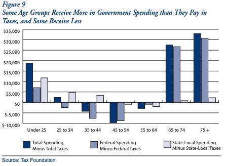
Americans' relationship with the federal balance sheet shifts dramatically over the life cycle. People under 25 and over 65 receive substantially more in government spending than they pay in taxes, while working-age adults (roughly 35 to 54) are net contributors. The imbalance is especially pronounced for Americans over 75, who receive tens of thousands of dollars more per year in benefits than they pay in.
Does NOT include is intragovernmental debt, which is debt the federal government owes to itself, mainly through trust funds like Social Security.
The attraction is obvious. T-bills are easy to sell, cheap to issue and eagerly absorbed by money market funds. They are the most liquid corner of global finance and the least visible to political scrutiny. In the US Treasury’s words, T-bills serve as a “shock absorber” for short-term funding needs — the cleanest way to borrow at the “least cost over time.”
Some good figures in there.
They'll have to move on this soon. The thing to do is 1. tight monetary policy, 3.5% NGDP growth, as a goal to be approached over years. You do that because it tends to push down nominal rates, across maturities. Revenue grows slower too, at these debt levels, probably favors the debtor. Also increases value of Fed bond holdings. 2.VAT. Introduces revenue, and makes people think twice about what really deserves spending. 3. Gate Social Security for under 75s behind a modest work requirement, that would get the rich ones to give it up and save us some money.