


Having laid out our goal of surfacing what’s currently missing from the healthcare debate for this sprint, we’re excited to start digging in. This article — the first substantive one of the sprint — is meant to illuminate the realities of the US healthcare system in a quantified and visualized way. As you’ll see below, there are a few key themes that are quite evident in the data: Americans live an unhealthy lifestyle, they rely and spend heavily on drugs and procedures, and the government is increasingly footing the bill.
Let’s kick it off with life expectancy data.
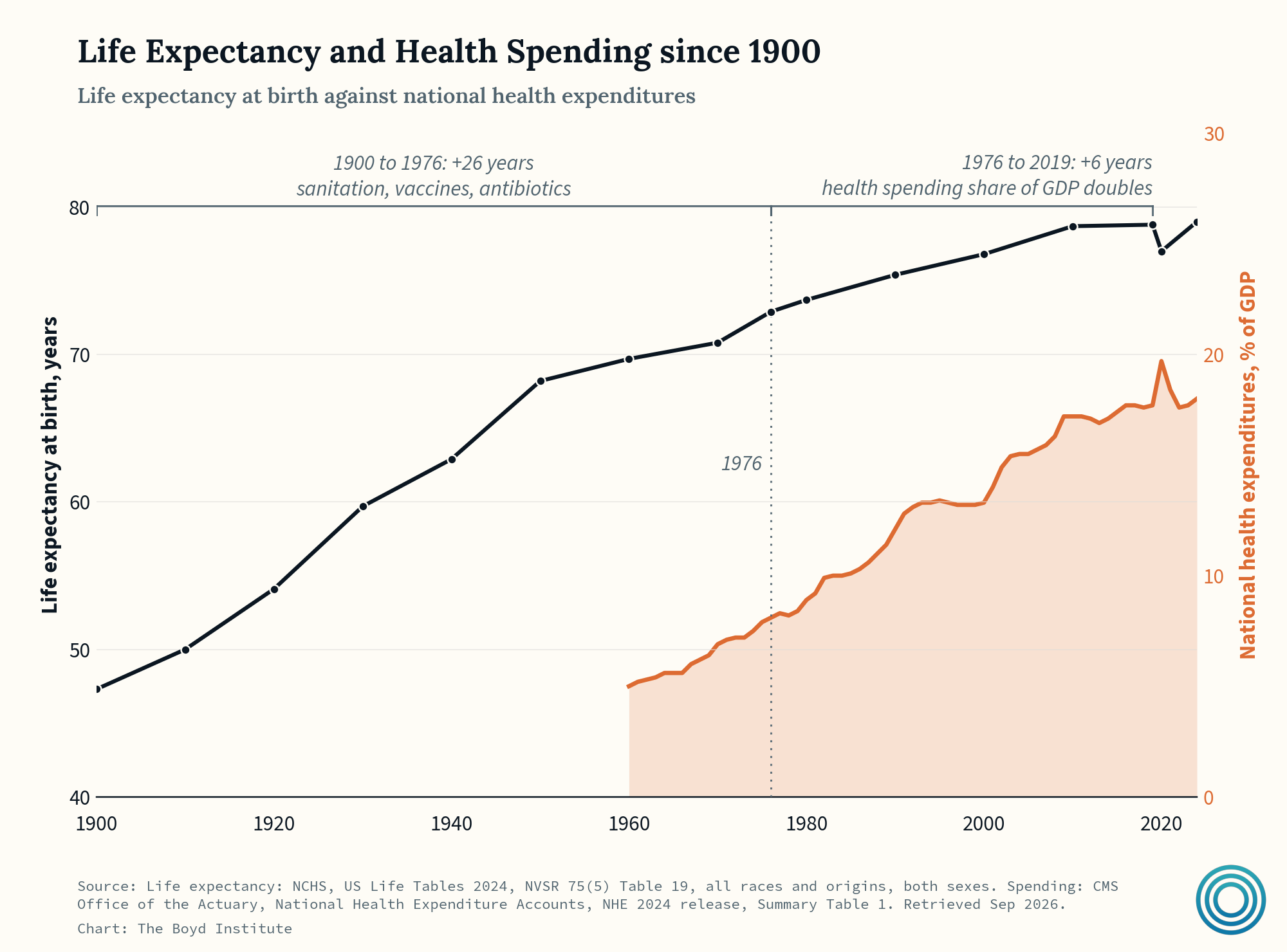
Life expectancy at birth is mostly a statistic about children. In 1900 about 1/10th of American babies died before their first birthdays. By 1976 it was one out of every 65. Most of these gains occurred without dramatic increases in spending on healthcare. But since 1976, when life expectancy at birth was already 73, health spending as a share of GDP has roughly doubled alongside squeezing out life expectancy gains of only 6 years.
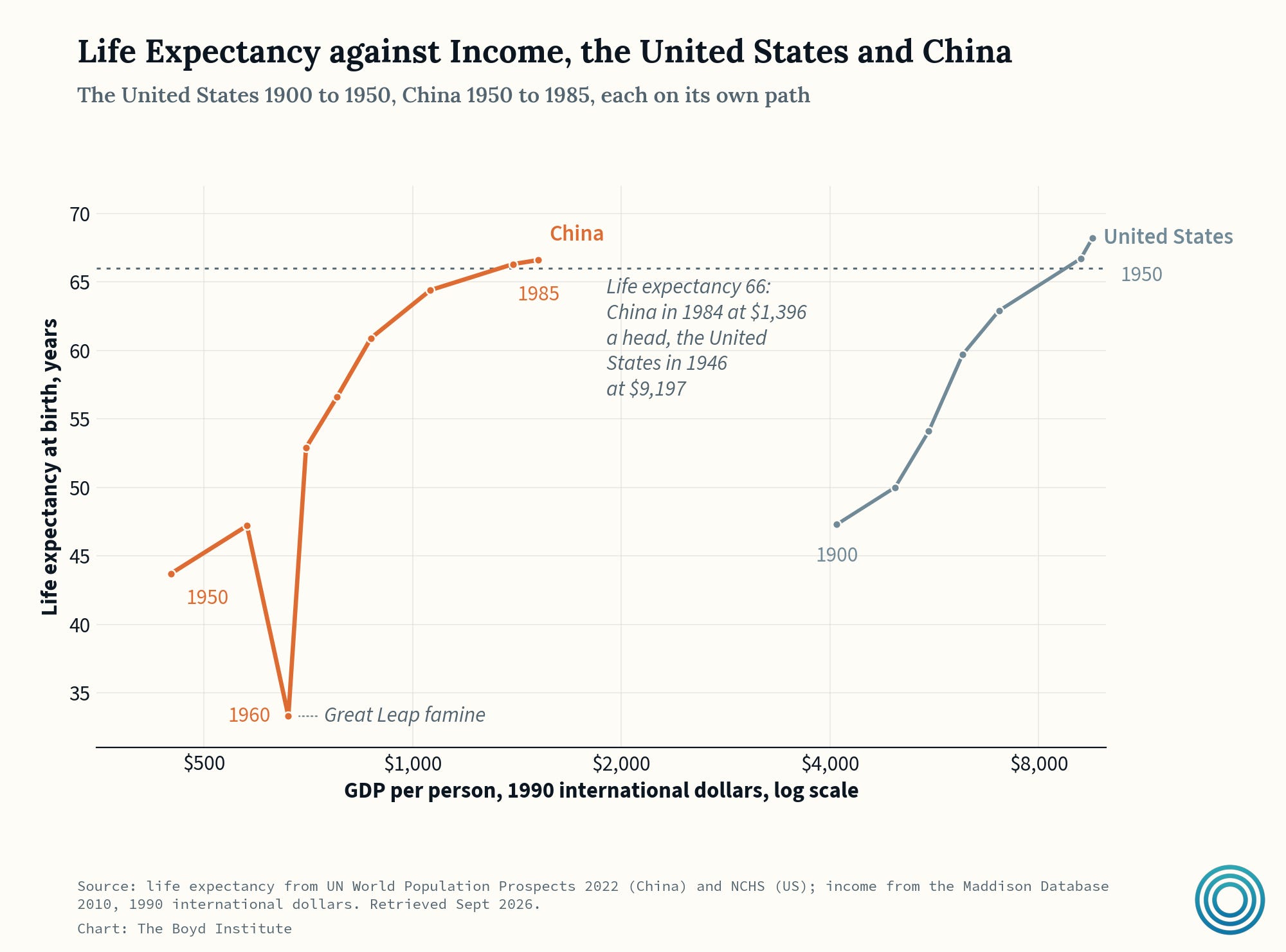
The United States reached a life expectancy of 66 in 1946, at an income of about $9,200 per head in 1990 dollars. China climbed to the same level on only about $1,400 per head, across a period that included the Cultural Revolution and a catastrophic self imposed famine. Still, the interventions such as sanitation campaigns, mass immunization, and the barefoot-doctor program generated a huge lift. In effect, China got healthy before it got rich.
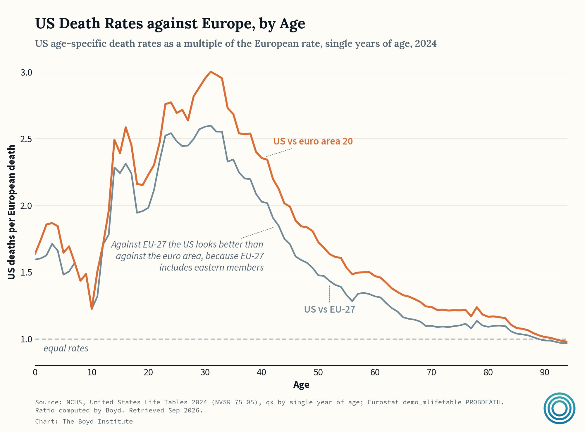
Now, if you look at US age-specific death rates vs. Europe, the peak sits where almost nobody dies of disease — in the range of where spending is NOT concentrated — and collapses into the disease-ridden years of a person’s life.
So what’s actually driving the discrepancy?
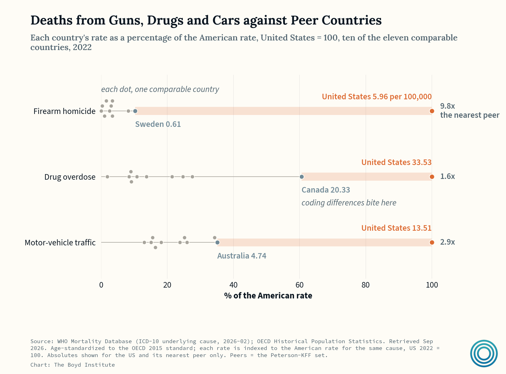
A nontrivial factor is the guns, drugs, and cars — none of which are “healthcare” deaths per se. But together they are why American life expectancy fell three years in a row in the mid-2010s, the first sustained peacetime fall since the 1918 flu.
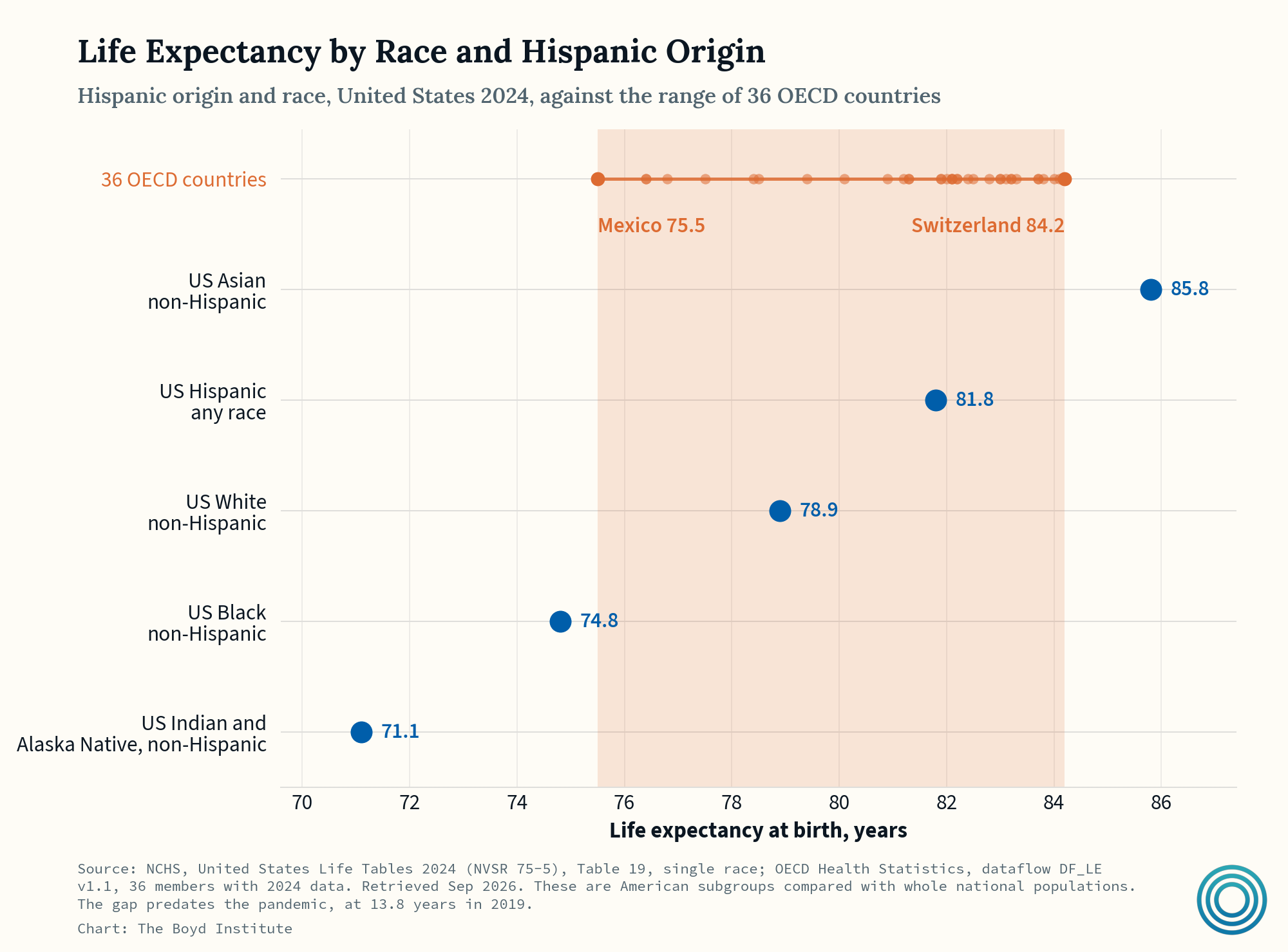
Interestingly, significant racial disparities exist in life expectancy. Depending on the sub-population, life expectancies in the US vary by a lot, even under the same health system. How? What separates the top from the bottom, in reality, is income, place — and importantly, deaths from guns, drugs, and cars, which fall hardest on the last three groups.
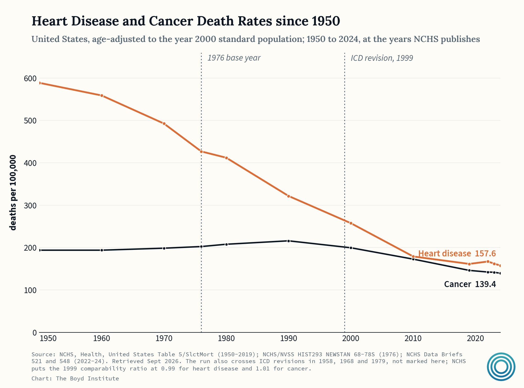
As for the older end of the spectrum, age-adjusted deaths from heart disease have fallen from 412 per 100,000 in 1980 to 161 in 2019, and cancer mortality, flat through 1990, has since fallen by a third. The decline in heart disease is especially important and revealing because it has coincided with a dramatic increase in obesity.
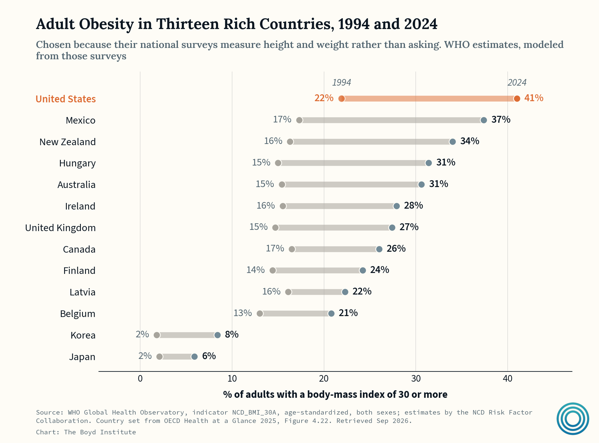
So, heart-disease deaths collapsed as one of its main risk factors (obesity) trended in the exact opposite direction — clear evidence of medical advancements.
Nevertheless, we still spend far more money on healthcare for the people who are disease-prone than on the ones who aren’t…
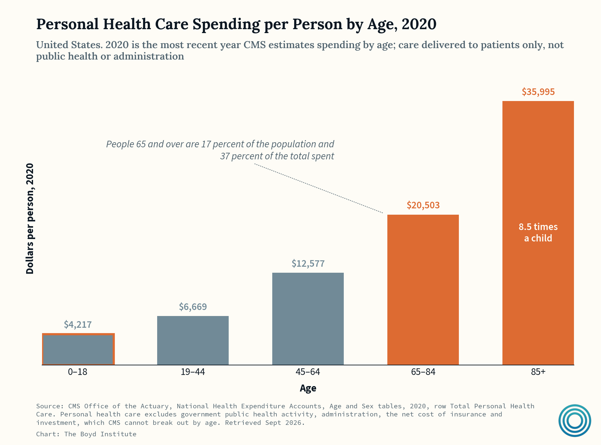
Personal health care spending per American in 2020 on people over 85 was 8.5x that of a child. An aging country that is no longer dying from it’s main disease naturally spends more, which explains why about a quarter of Medicare’s money goes to people in the last year of their lives (and this share has barely moved since the 1970s).
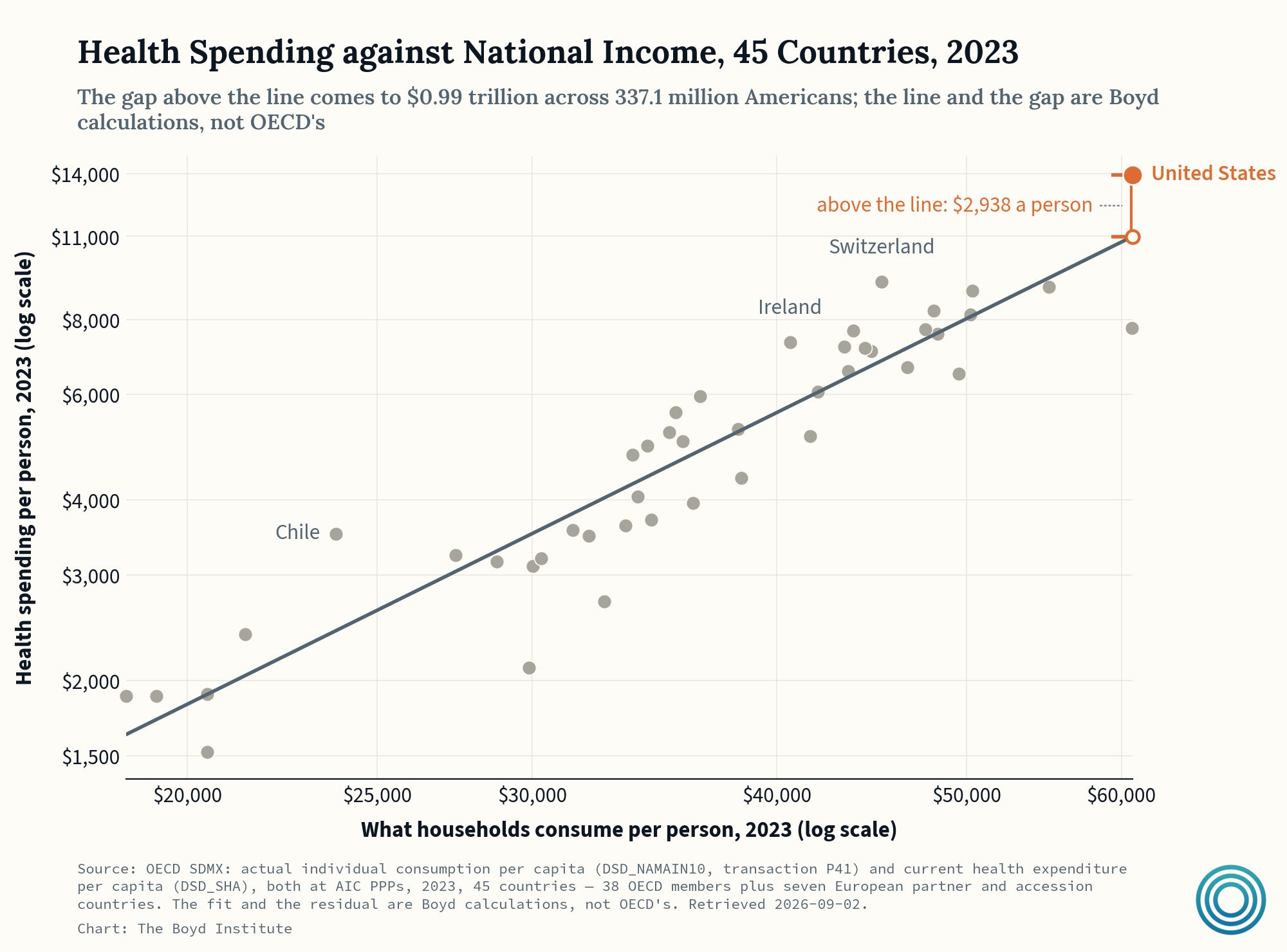
Zooming out, rich countries just spend more on healthcare, and above-trend US spending amounts to a few thousand dollars per year per capita.
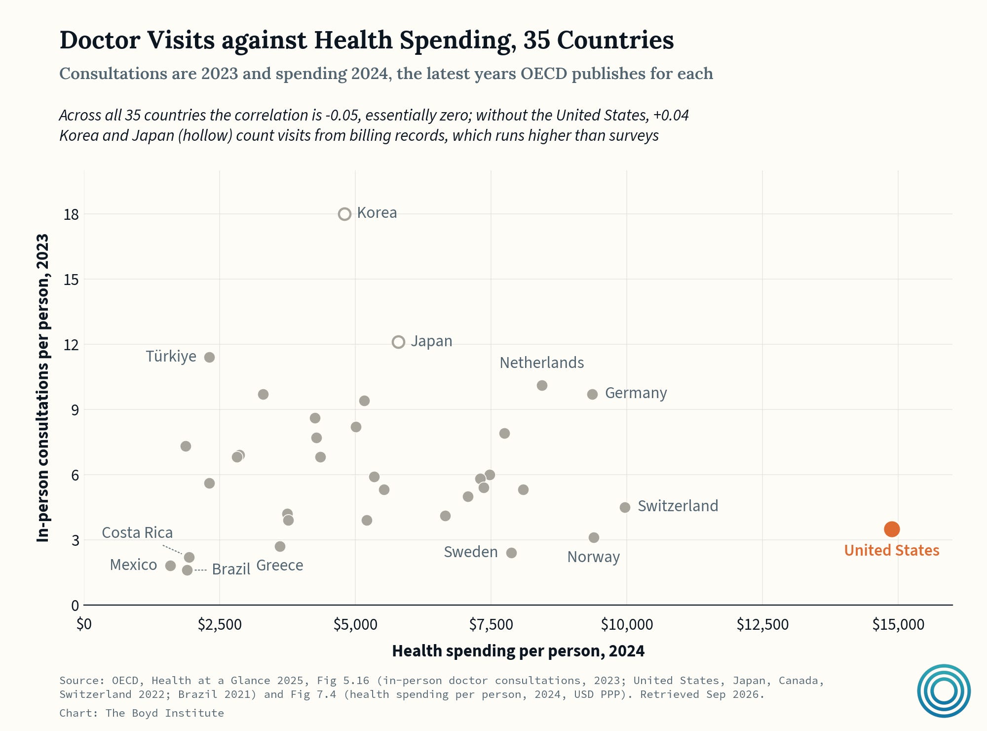
Americans see a doctor less often than people in other major countries, but that says very little about what a health system costs. Furthermore the delta also isn’t explained by “administrative bloat.”
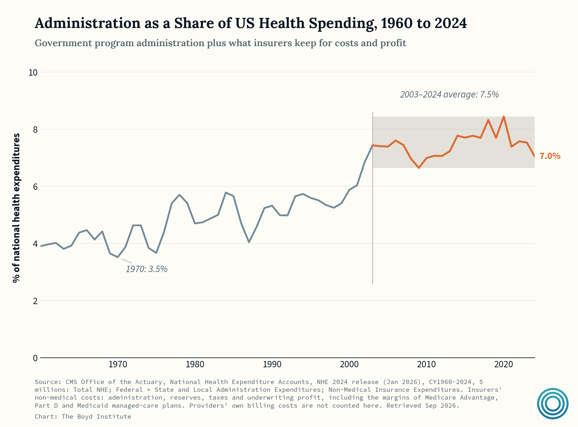
The viral chart showing a massive divergence — administrators up +3,000% since 1970 against doctors up +150% — is highly misleading. When counting actual dollars spent, admin-related spending is basically flat (or at least rangebound) since 2003.
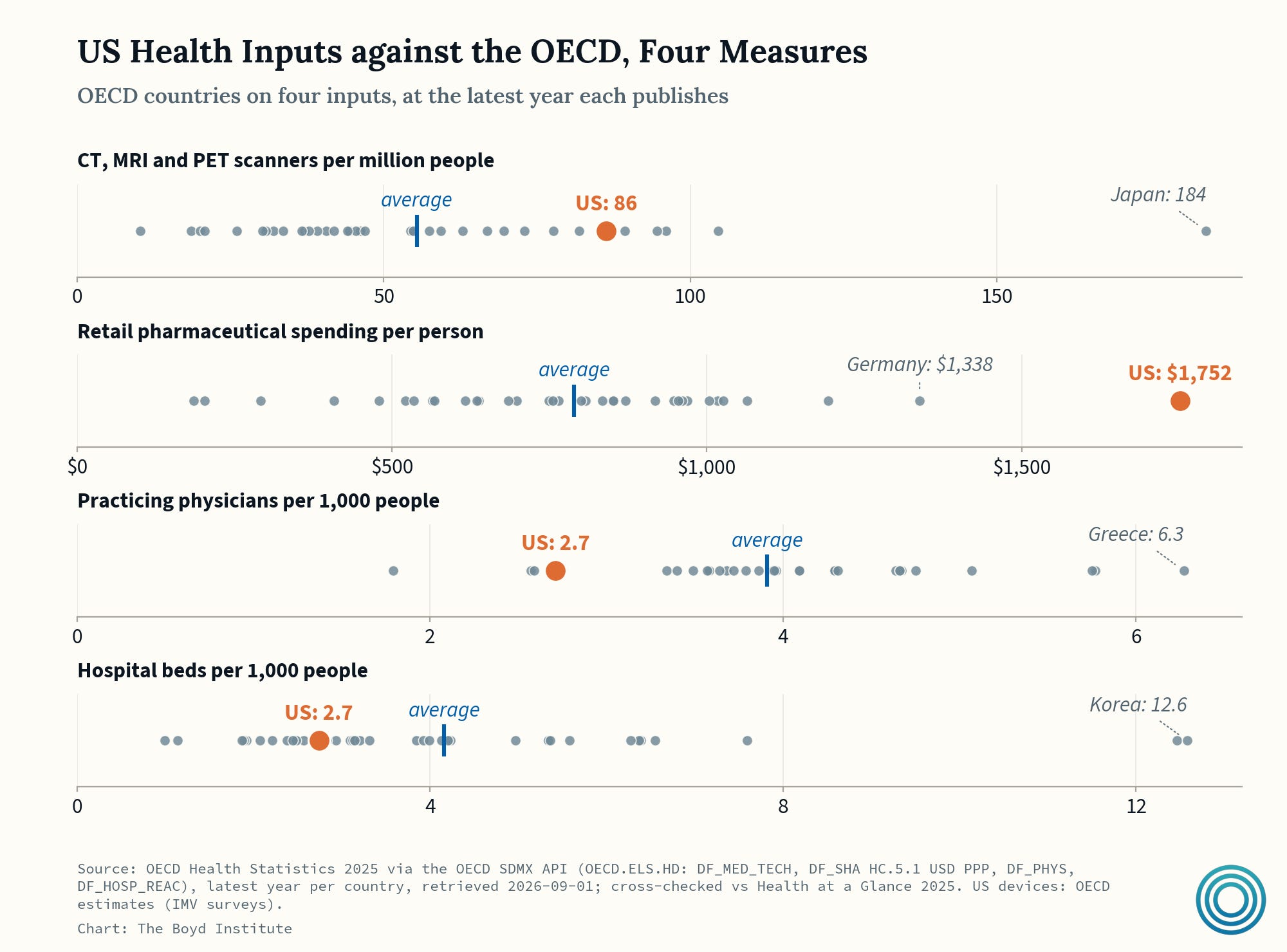
The US is rich in machines and drugs, but poor in doctors and hospital beds — the read here being that the cost drivers have more to do with the fact that whatever a hospital can simply buy, America has a lot more of. And whatever a license or statute controls, it has much less of. Scanners and drugs can just be purchased fairly simply.
But beds are rationed by state laws, and doctors have also been “under-rationed” in a certain sense...
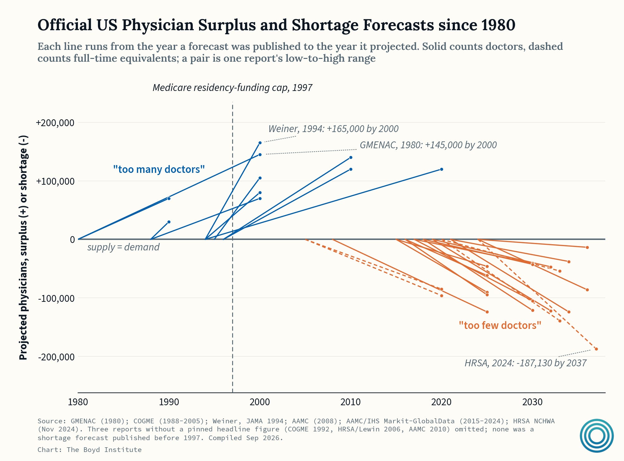
There was basically never a doctor shortage until after Congress cut funding. Throughout the 1990s, the Council on Graduate Medical Education warned Congress of a looming physician surplus. A couple highlights:
1994: “The reduced physician growth rate and increased proportion of generalist physicians attained by implementing COGME’s goals can be expected to substantially reduce health care expenditures.”
1996: “COGME recognizes that the nation’s most significant workforce problem is an increasing surplus of physicians, primarily of specialists.”
Congress took their advice and capped the number of federally funded residency slots in 1997. Whoops.
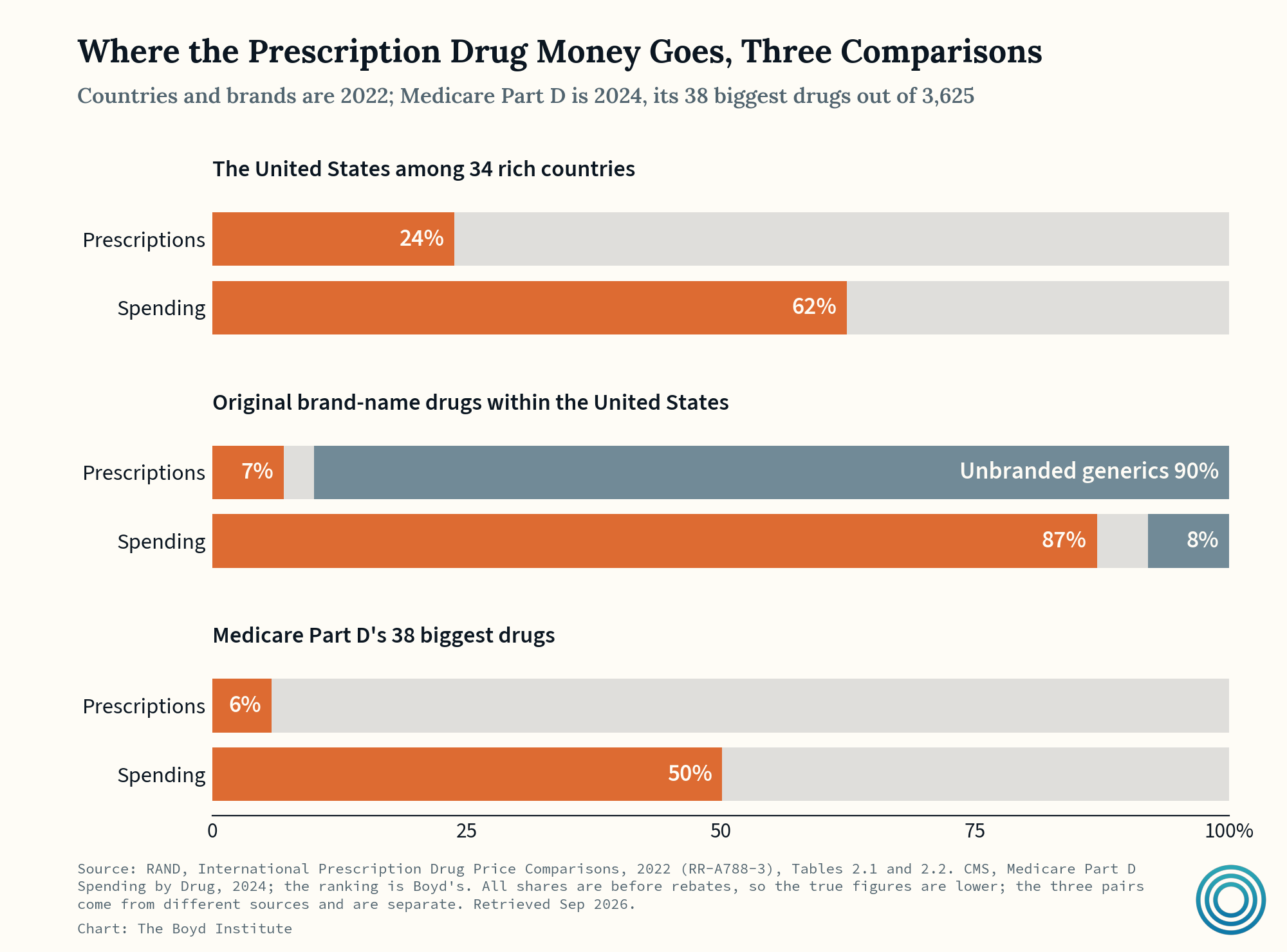
On the pharmaceutical drugs side of things, however, it’s certainly not much of a supply-side story. Americans have the most access to the latest and most expensive drugs, and they pay up for them. It is the very small sliver of expensive, non-generic drugs that drive the overall spending in America.
Zooming back out once more, here’s how much we’re paying, and who is actually paying for it…
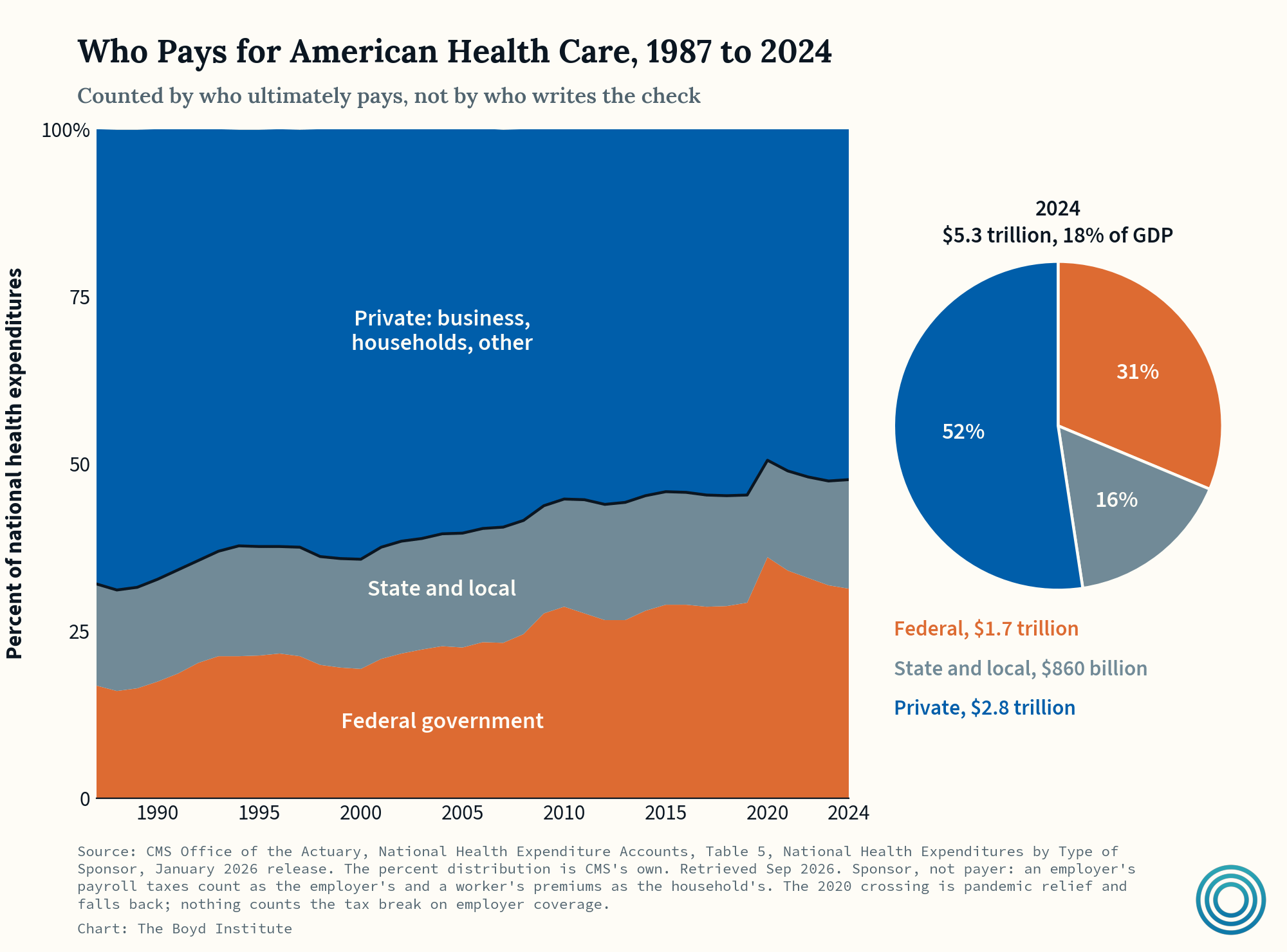
Government healthcare financing alone accounts for nearly half of American healthcare spending — 8.5% of GDP — while private spending adds another 9.5%. Meanwhile, the average OECD country spends 9.3% of its GDP on healthcare in total.
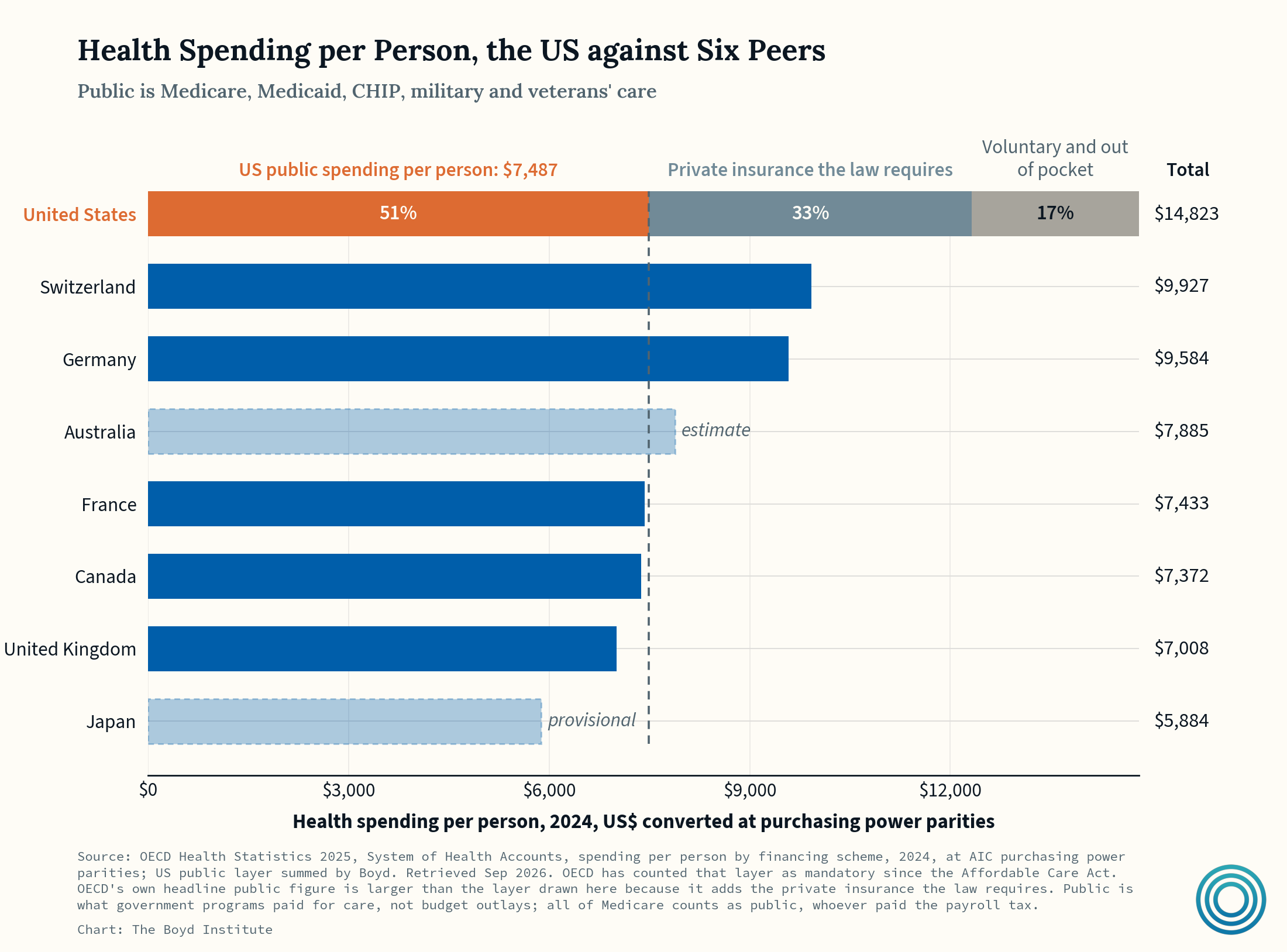
American public health spending alone exceeds what Britain, Canada, France, or Japan spend on health in total. So, it’s pretty evident the US has an efficiency problem, not a generosity problem.
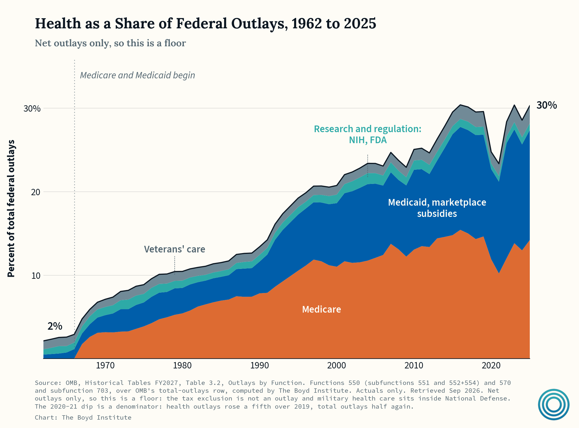
Healthcare took two cents of every federal dollar in 1962, but now takes thirty. And the “generosity” surrounding Medicare in particular has contributed heavily to the cost explosion.
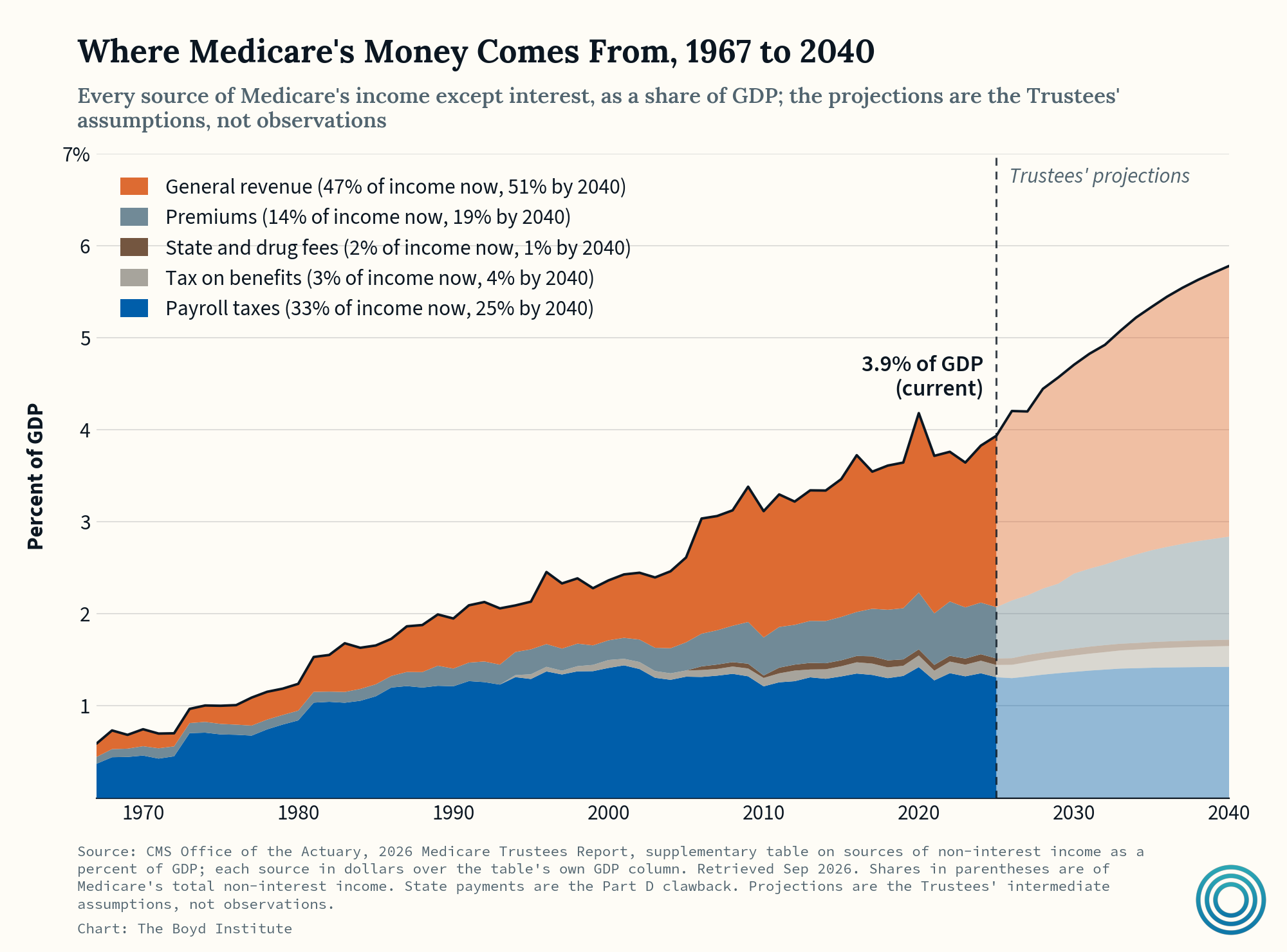
Medicare has always relied on a mix of funding streams. Part A (hospital insurance) is funded by payroll taxes, while Part B (outpatient and physician coverage) and Part D (prescription drug coverage) are covered by a mix of beneficiary premiums and transfers from general tax revenues.
As Medicare’s costs have increased, general revenues (i.e., deficit spending) have picked up most of the tab — importantly, crowding out other budget priorities, as it now comprises a significant part of what is making the federal interest bill explode too.
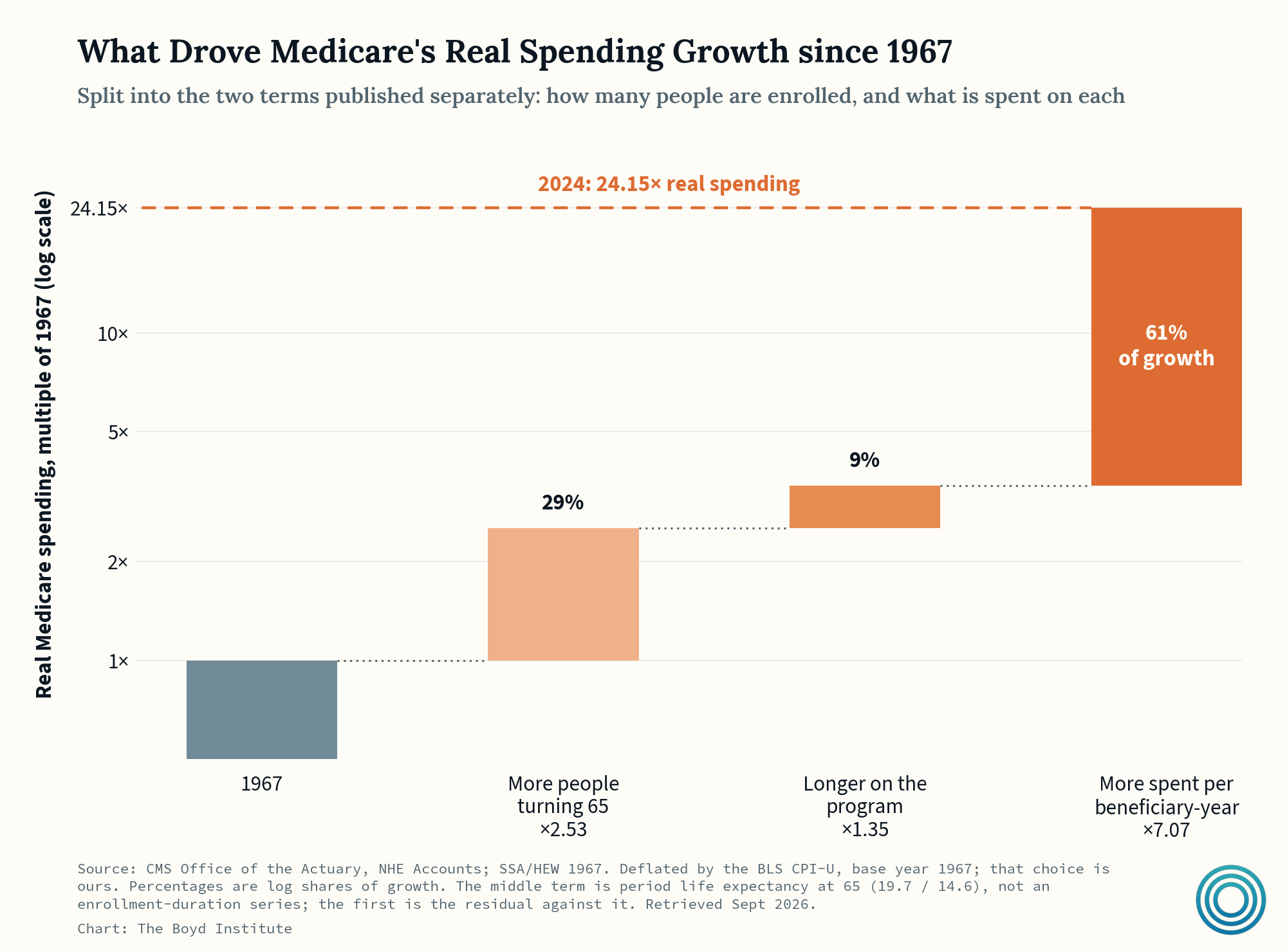
Essentially, the lion’s share of growth in Medicare spending has not come from changing demographics. The big bar (61% of growth) is not so much price increases as it is medicine that barely existed in 1967 — dialysis, bypass, stents, joint replacements, statins, biologics, etc. In other words, the ballooning costs come from spending on new technologies in an environment where doctors and patients default to “yes,” and where price is an afterthought.
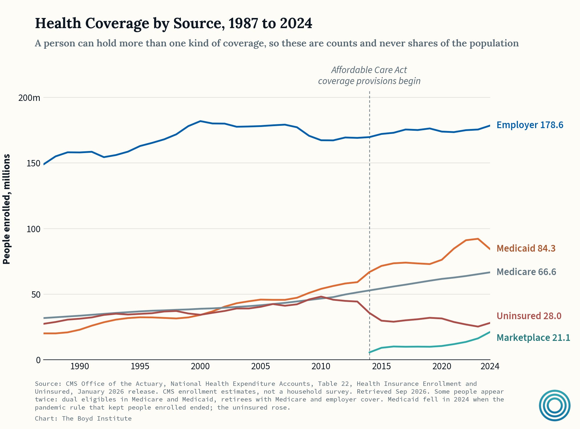
The share of the population receiving government-financed insurance has grown considerably since the 2008 recession. From 2008 to 2024, Medicaid grew from 13.4% of the population to 20.4%, while Medicare grew from 10.9% to 14.8% of the population. The individual market also became heavily subsidized post-ACA: 92% of Marketplace enrollees received a subsidy in 2024.
If you appreciate the work we do at Boyd, please consider upgrading to a paid subscription, as we’re trying to become entirely reader-funded in the long term.
Additionally, as always, please comment with your thoughts on the data, and what you think is missing from the healthcare debate!
Great charts! The one showing the percentage of federal outlays going to healthcare may actually understate the problem. As a percentage, outlays look to have plateaued over the last 10 years, but, in absolute terms, outlays have increased dramatically as federal spending took off.
Brilliant summary; the best I've seen on this topic.